ABC SYMBOLE
Bibliographic Details
- Title
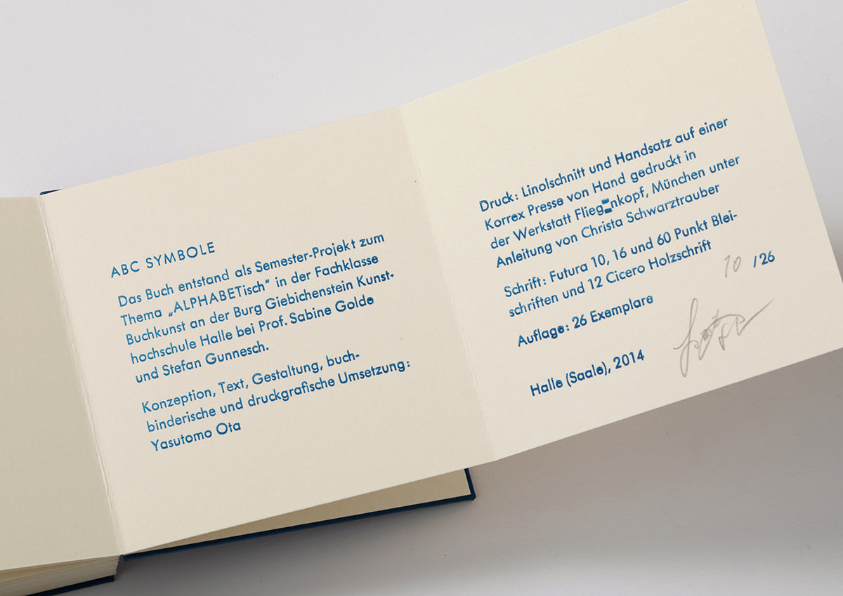
- ABC SYMBOLE
- Artist
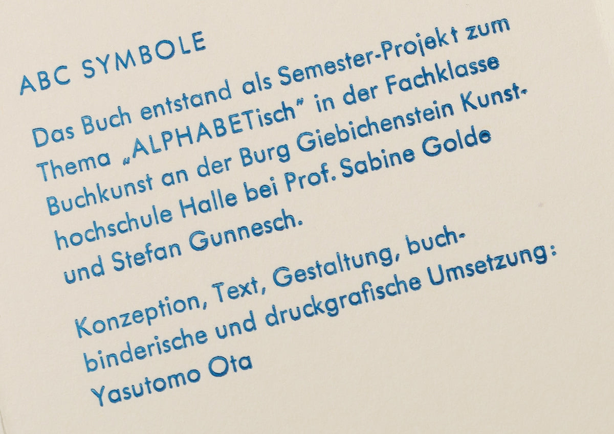
- Yasutomo Ota / 太田泰友
- Year
- 2014
- Size
- h100 × w100 × d30mm
- Weight
- 330g
- Language
- German / ドイツ語
- Printing
- 活版印刷(木活字、鉛活字)、リノリウム版画
- Materials
- 紙、ボール紙
- Edition
- 26
- Condition
- new
The type sings
Alphabet on paper.
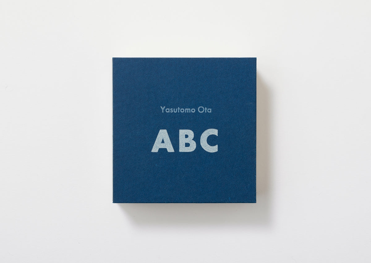
«ABC SYMBOL» 2014
This piece is based on the symbolism of alphabet letters.
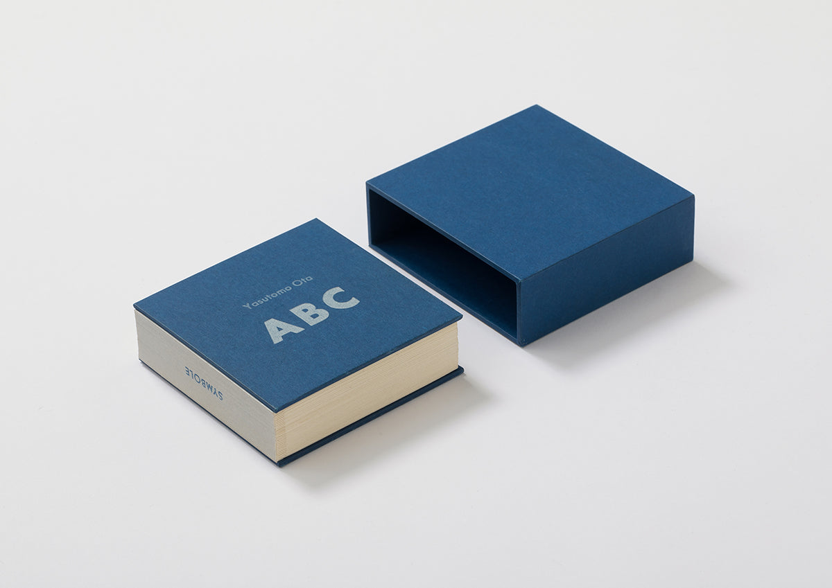
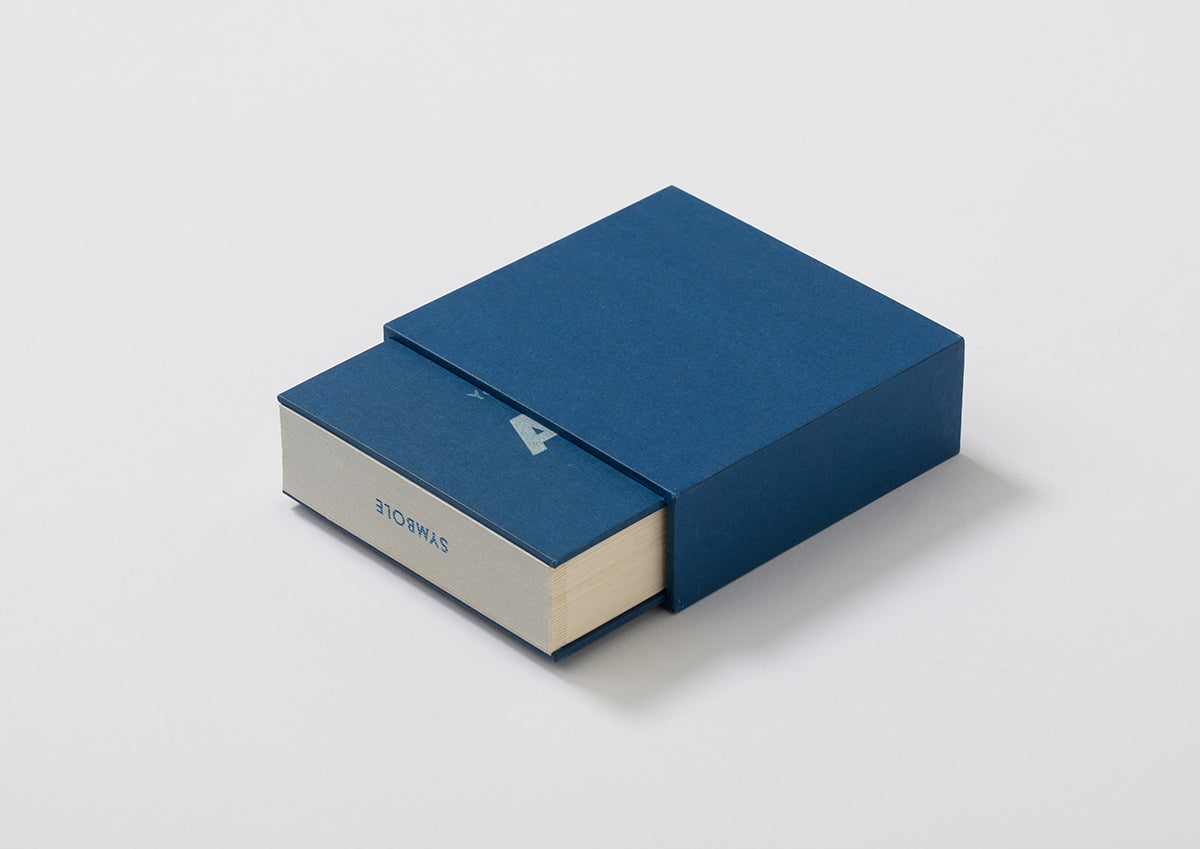
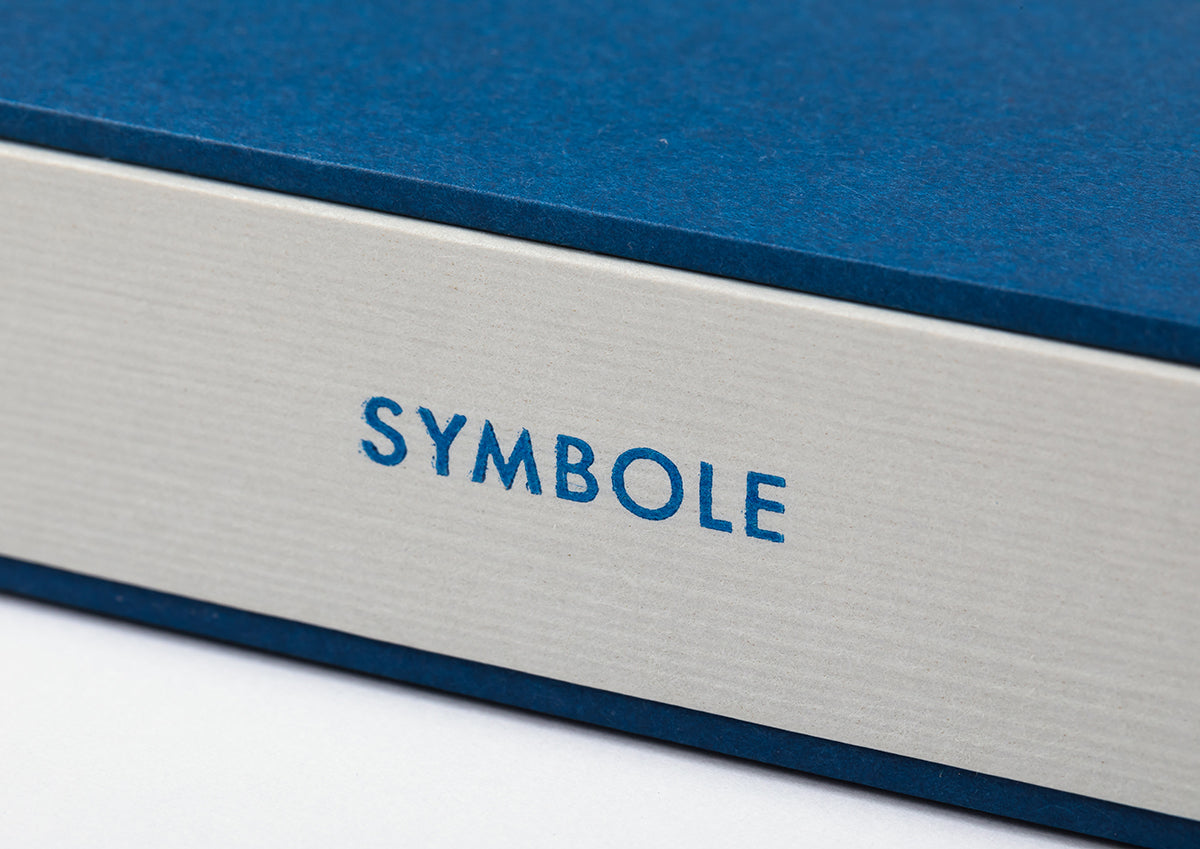
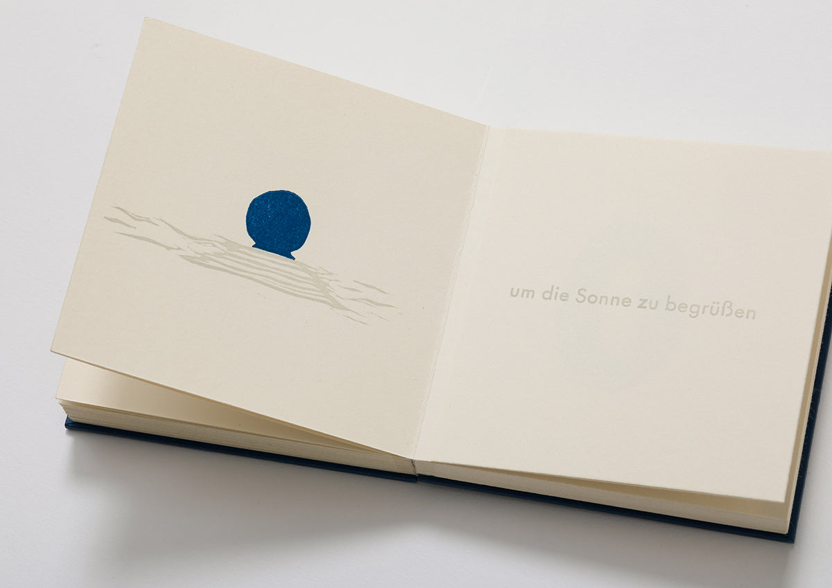
The size fits comfortably in the palm of your hand, the texture of the cloth, and the soft ABC shape of the title make it feel familiar. When you open it, you'll be excited by the light, flip-flap movements of the book, like a child's pop-up book. The soft impression of the wood type and the tasteful symbols of the prints create a worldview reminiscent of an adult picture book.
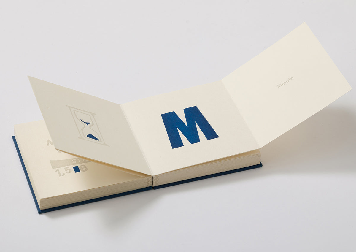
The book contains four elements for each alphabet from A to Z: a print that matches its symbolism, its function as a symbol, the alphabet letter, and the word that the alphabet represents.
Flip the cover and you will first see the "print" on the left side of the spread, and then the "function as a symbol" on the page immediately to the right. Next, turn the folded page toward the center of the spread to reveal the bold "alphabet" printed in wood type and the "word that the alphabet represents." For example, on the first spread of the "C" page, the words "print" and "to feel warmth" are arranged, and when you open the folded page again, the alphabet "C" and the word "degrees Celsius" appear. The short texts describing the function of each symbol are not descriptive like a dictionary with a clear definition, but use poetic expressions with implications that can evoke different scenes for each person, as in the example of "C." This structure makes it a work that naturally and smoothly induces the reader to enjoy the intellectual pleasure of turning the pages one by one while guessing what will happen next.
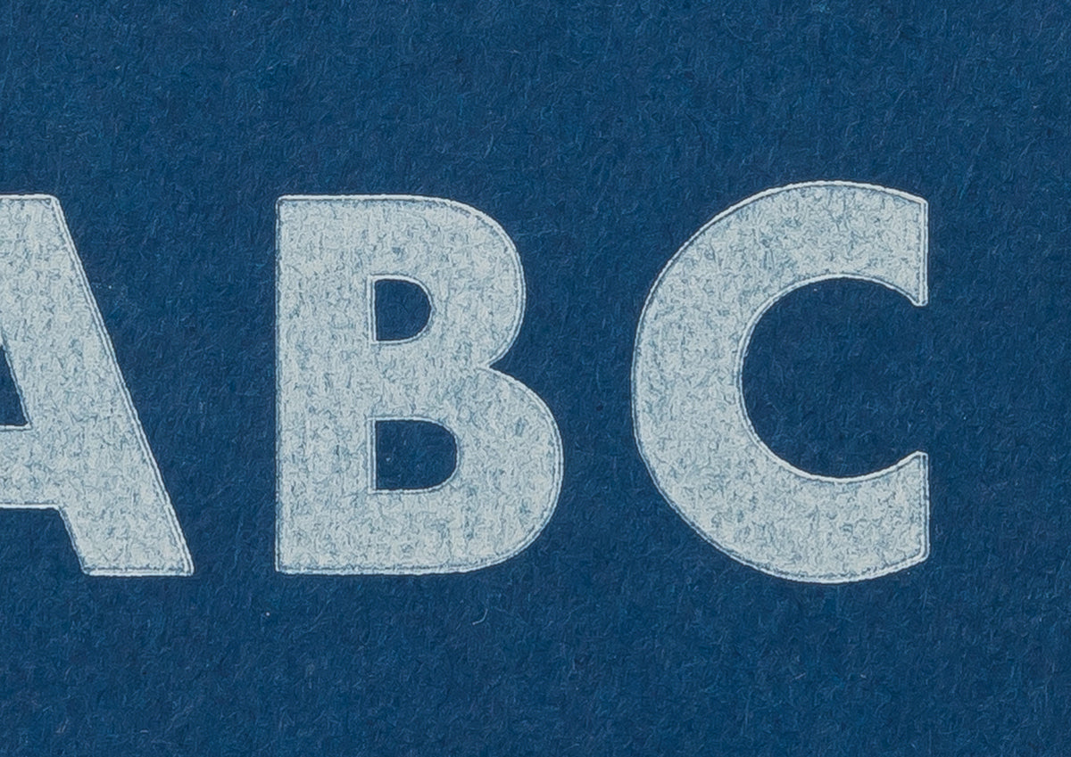
The large alphabetic characters are printed in wood type, the rest of the text in lead type, and the prints in linoleum.
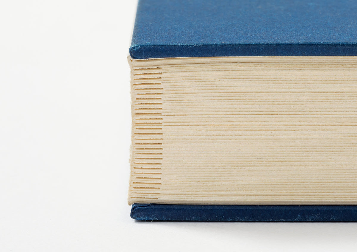
The binding method that plays an important role in this work is butterfly binding (also known as deccho-sou; the main text paper is folded inwards, layered in a valley fold, and glued together along the creases), which the artist himself adapted from a structure that resembles a butterfly with its wings spread when opened one by one. It is probably no coincidence that you feel a certain lightness, like that of a butterfly, every time you flip open the pages.
The thickness and size of a book are the most important elements that shape the exterior of the book. This book is thick due to its structure and the size of the wooden type that has played a part in its history, making it one size smaller than a paperback at 100mm x 100mm. It can be said that this book comes as close as possible to the phrase "functional beauty."
