


Nederlandse postzegels 1987+88


Bibliographic Details
- Title
- Nederlandse postzegels 1987+88
- Author
- ポール・ヘフティング / Paul Hefting
- Designer
- Irma Boom / イルマ・ボーム
- Publisher
- Staatsbedrijf der PTT
- Year
- 1988
- Size
- 251 x 191 x 16 mm, h251 x 191 x 10 mm,
- Weight
- 560g, 370g
- Pages
- 116p + 112p
- Language
- オランダ語 / Dutch
- Binding
- 袋綴じ(小口袋とじ製本)
- Printing
- 表は4色、裏は1色 / 4-color recto and black versos
- Condition
- 表紙少傷み、本文は良好
- ISBN
- 978-9012059039
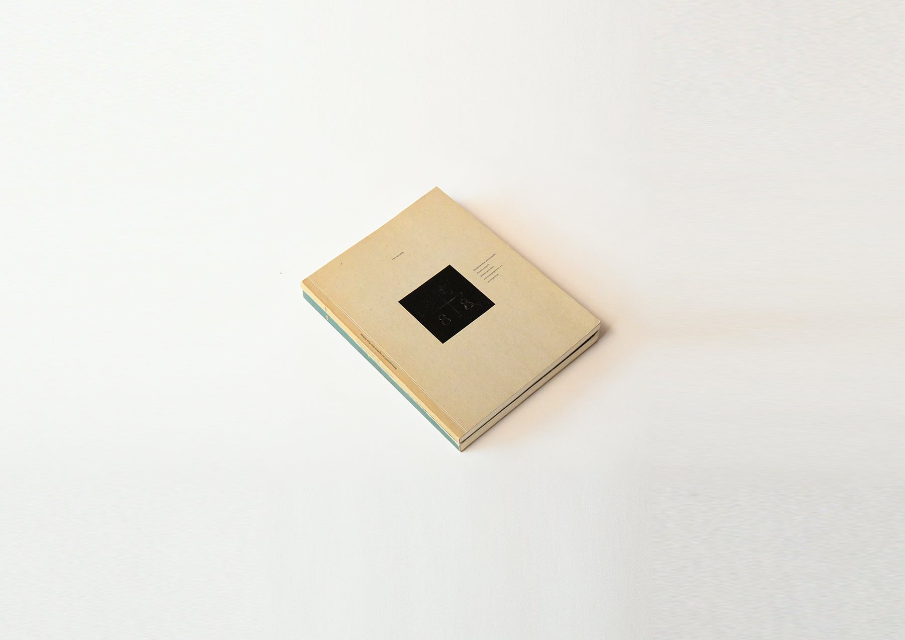
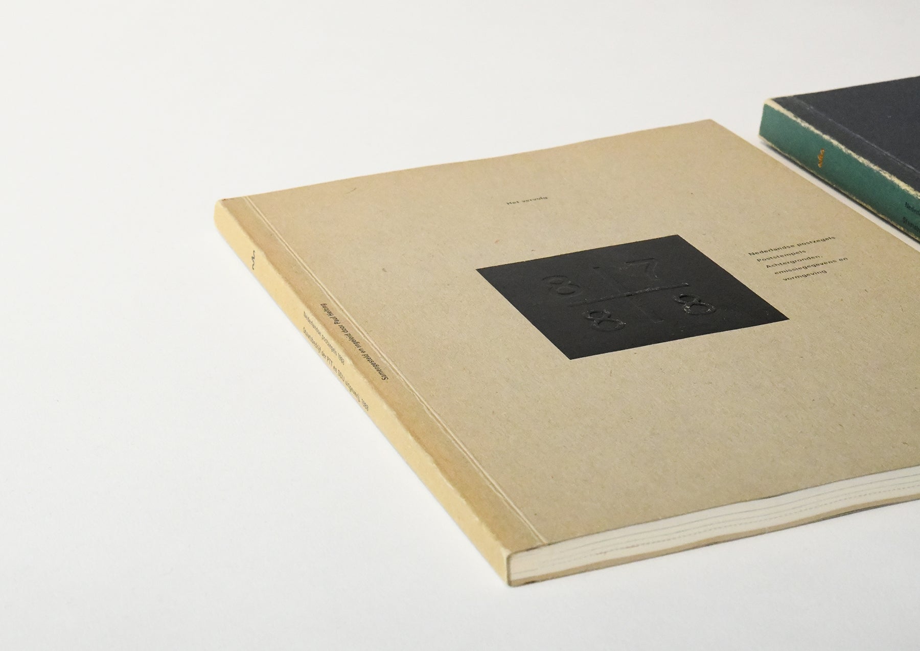
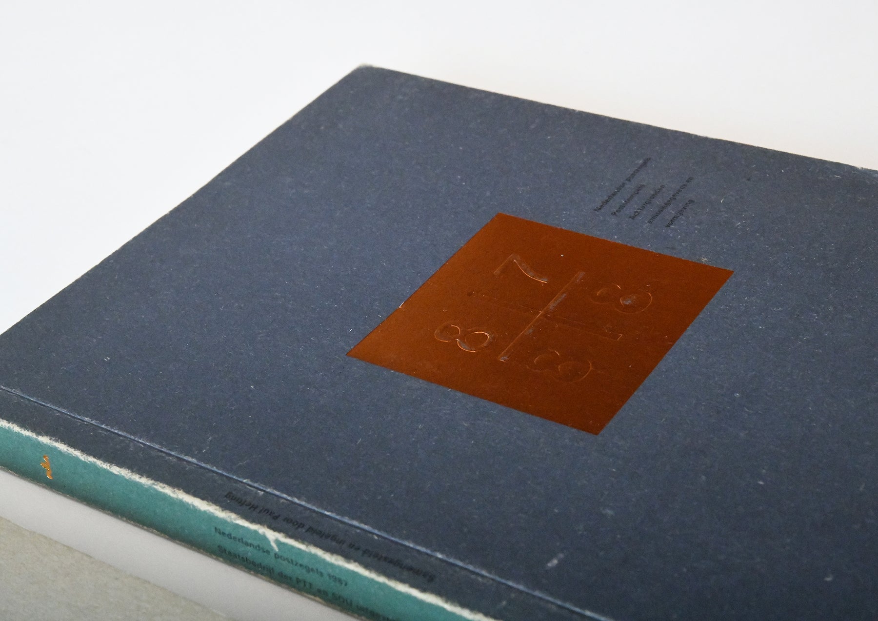
ニューヨーク近代美術館収蔵。表紙の箔押しホットスタンプは、経年の擦れで箔が落ちていますが、87と88の数字の組み合わせで、同じように見えて、たとえば87年の巻は「87」が凸で、「88」は凹むように、エンボス加工しています。
The genius Irma Bohm
A rare occurrence in the history of books
A beautiful failure.
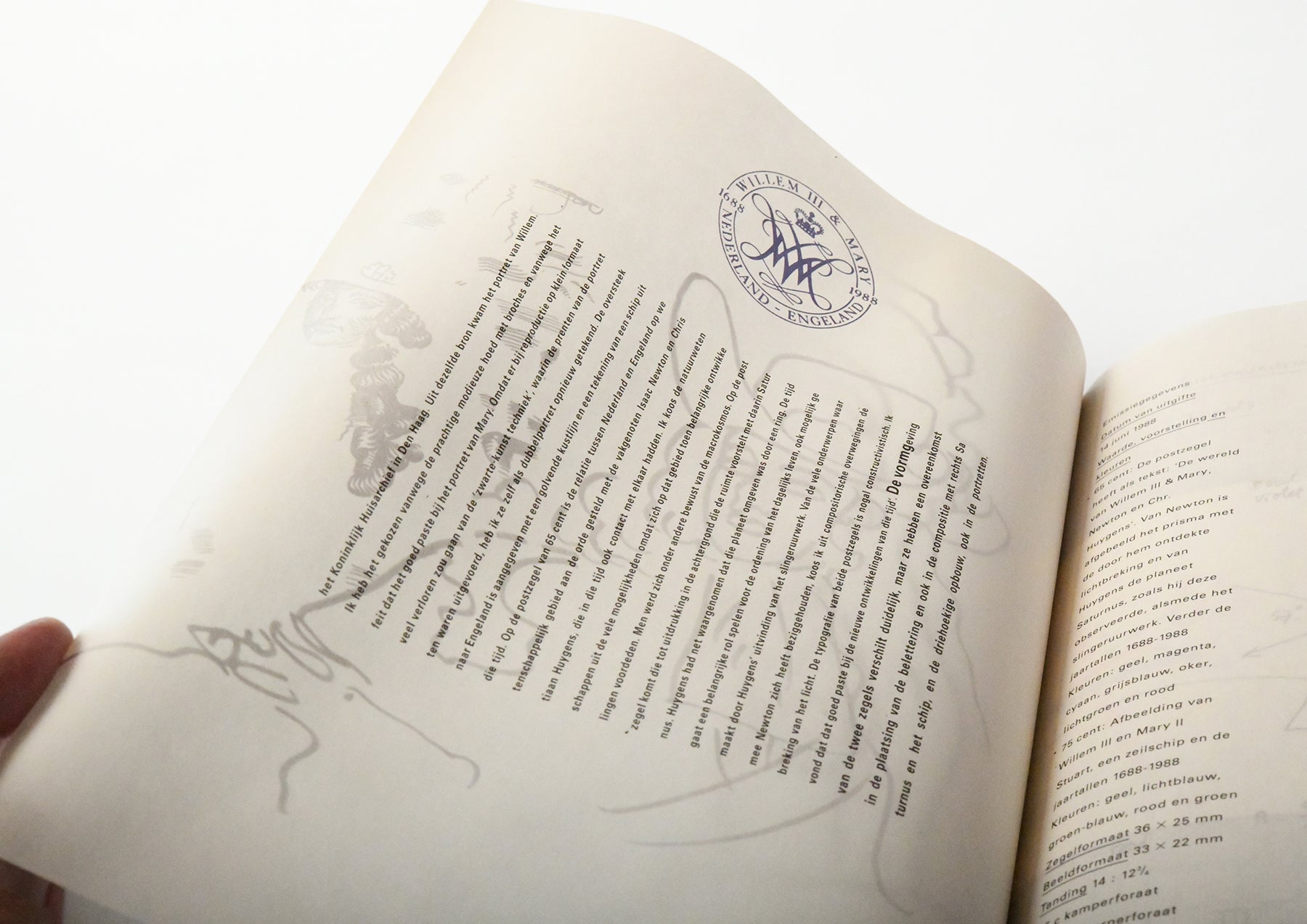
This is a book that Irma worked on while she was working at the Dutch national printing and publishing department (Staatsdrukkerij en). The client was the Dutch national postal company (PTT), which was working on the historic stamp yearbook that had been produced almost every year since 1920 by pioneers of Dutch design such as Karel Martens. Irma, who was still unknown at the time, was tasked with producing the two yearbooks for 1987 and 1988.
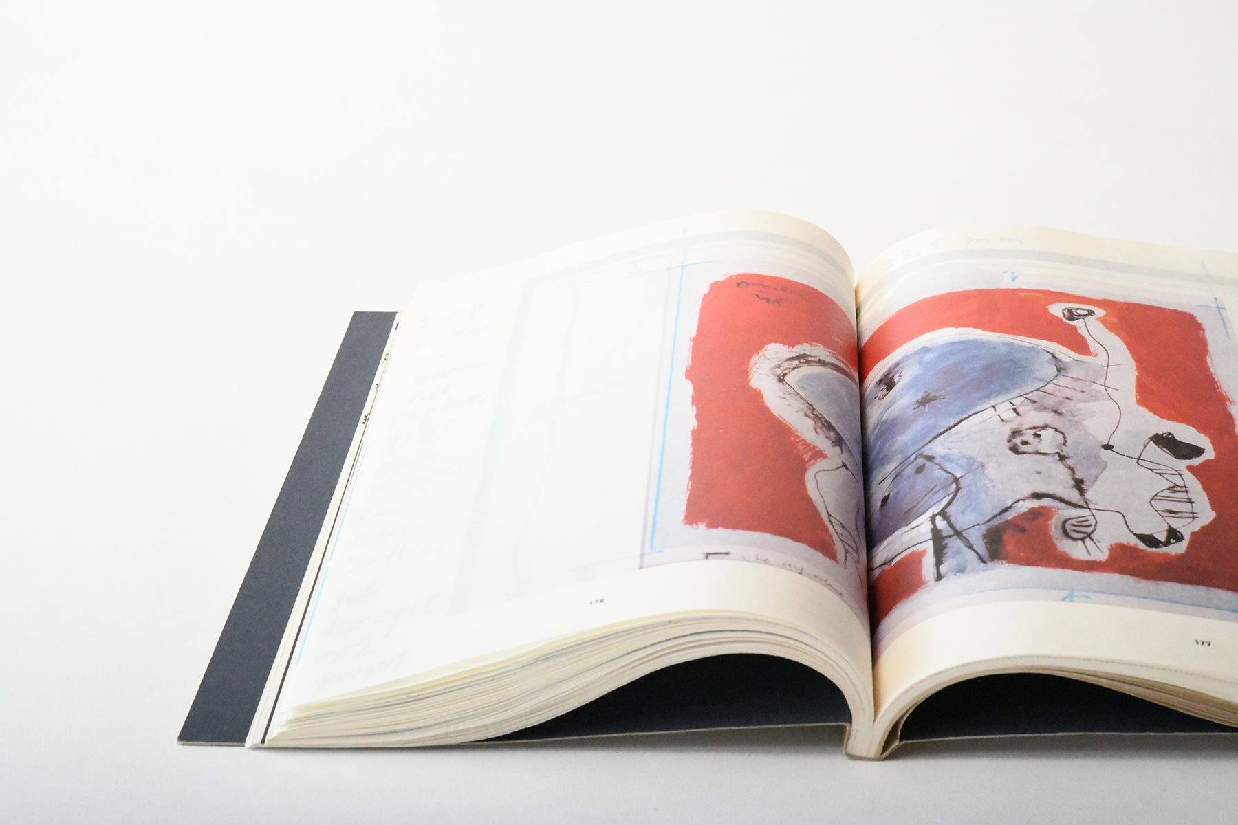
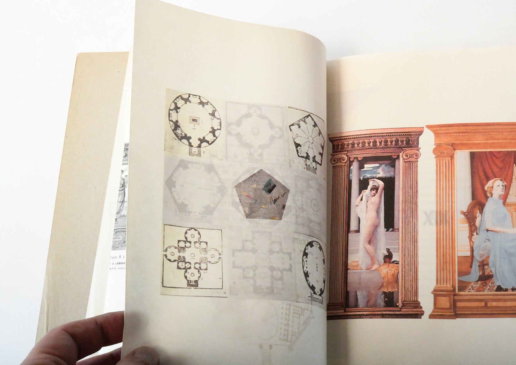
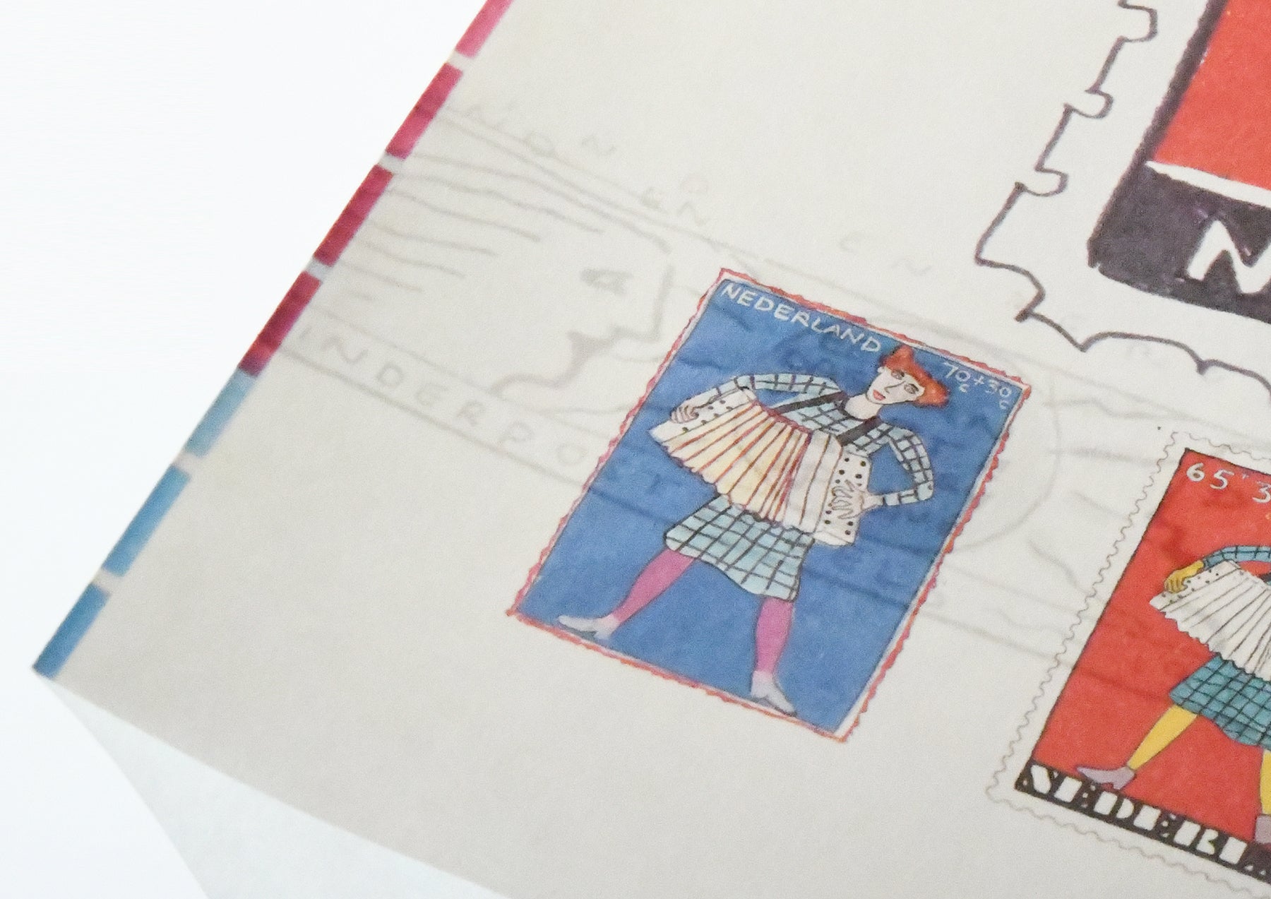
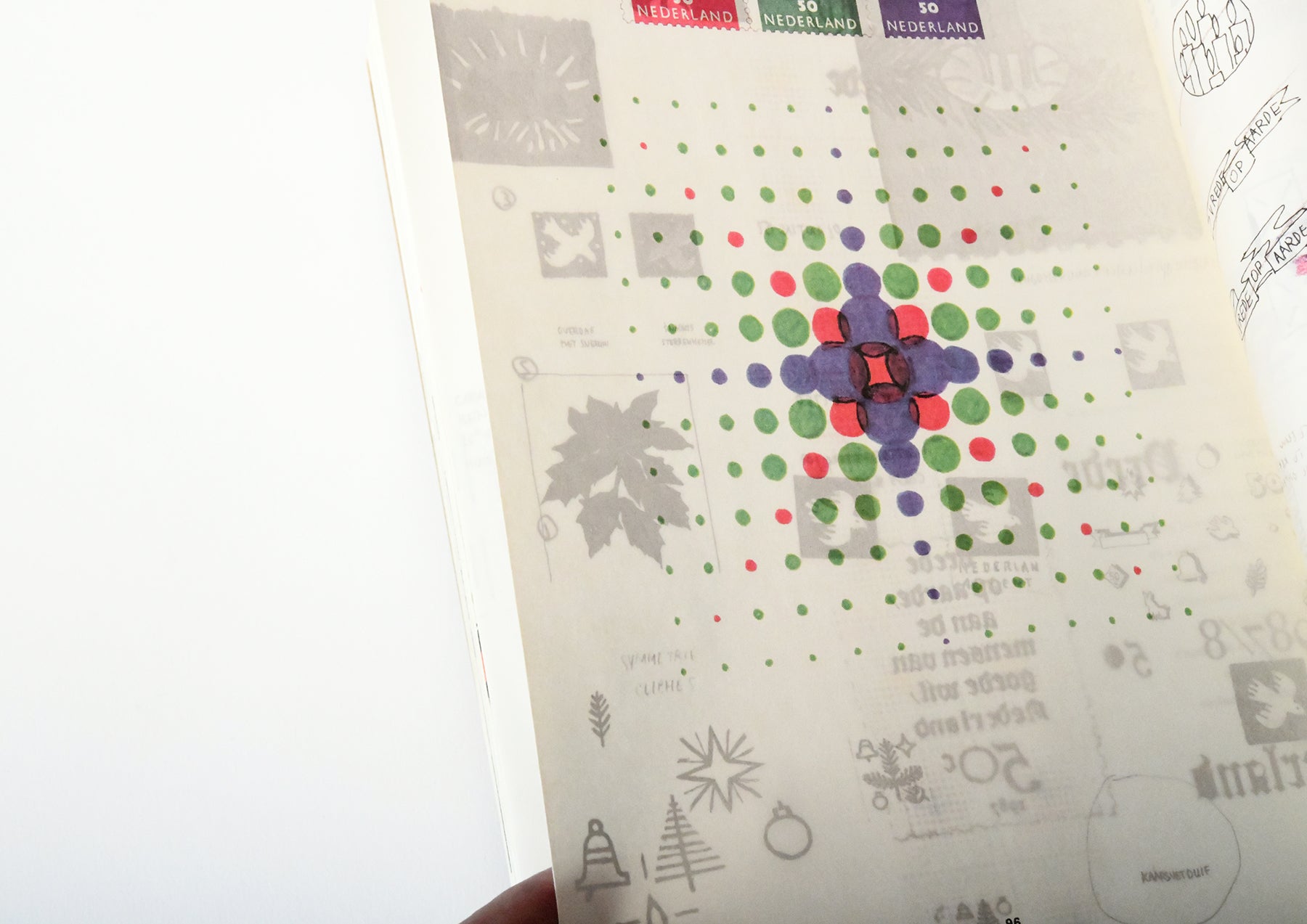
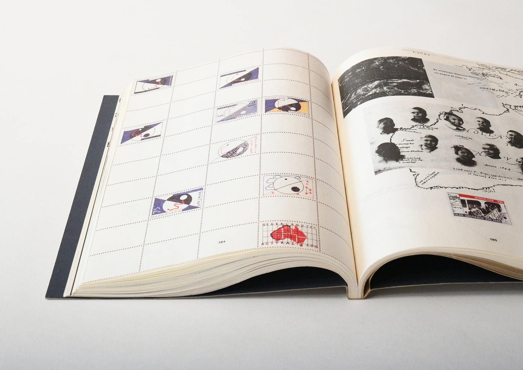
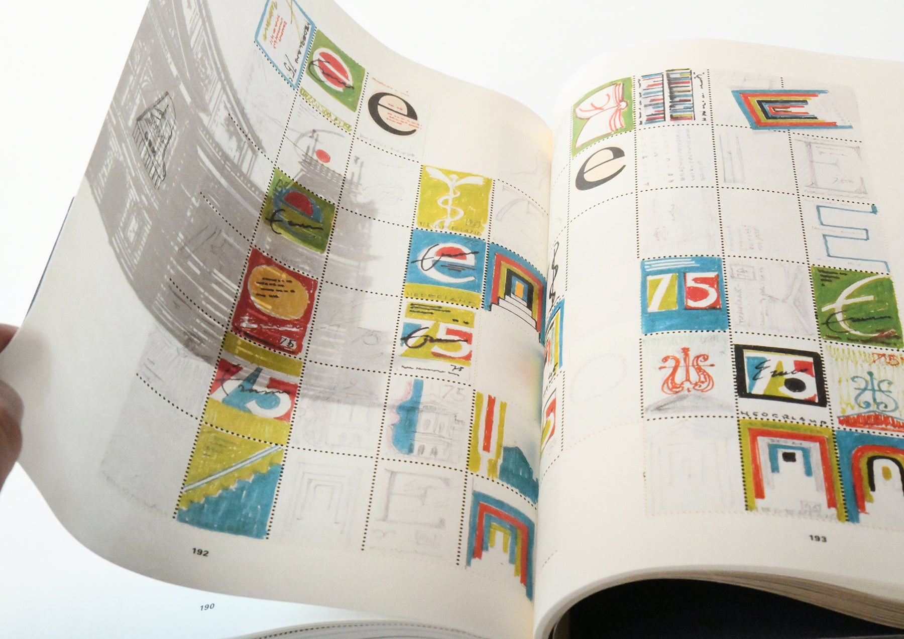
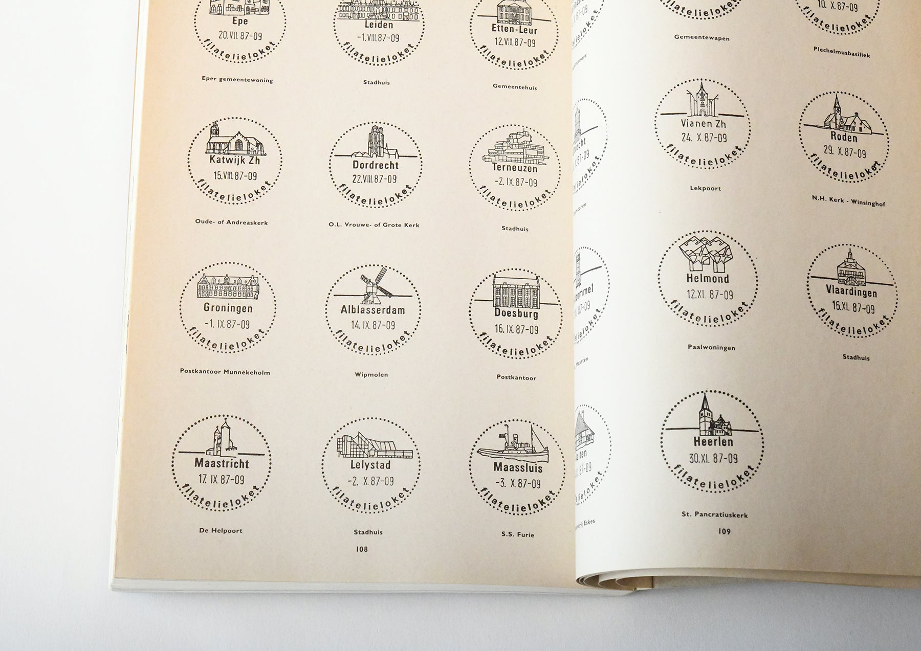
Irma's design philosophy was to include all of the stamp designs issued and postmarks used that year, while also associatively arranging other images that can be related to the stamp designs and motifs, in an attempt to make the stamp designs stand out above a host of other images.
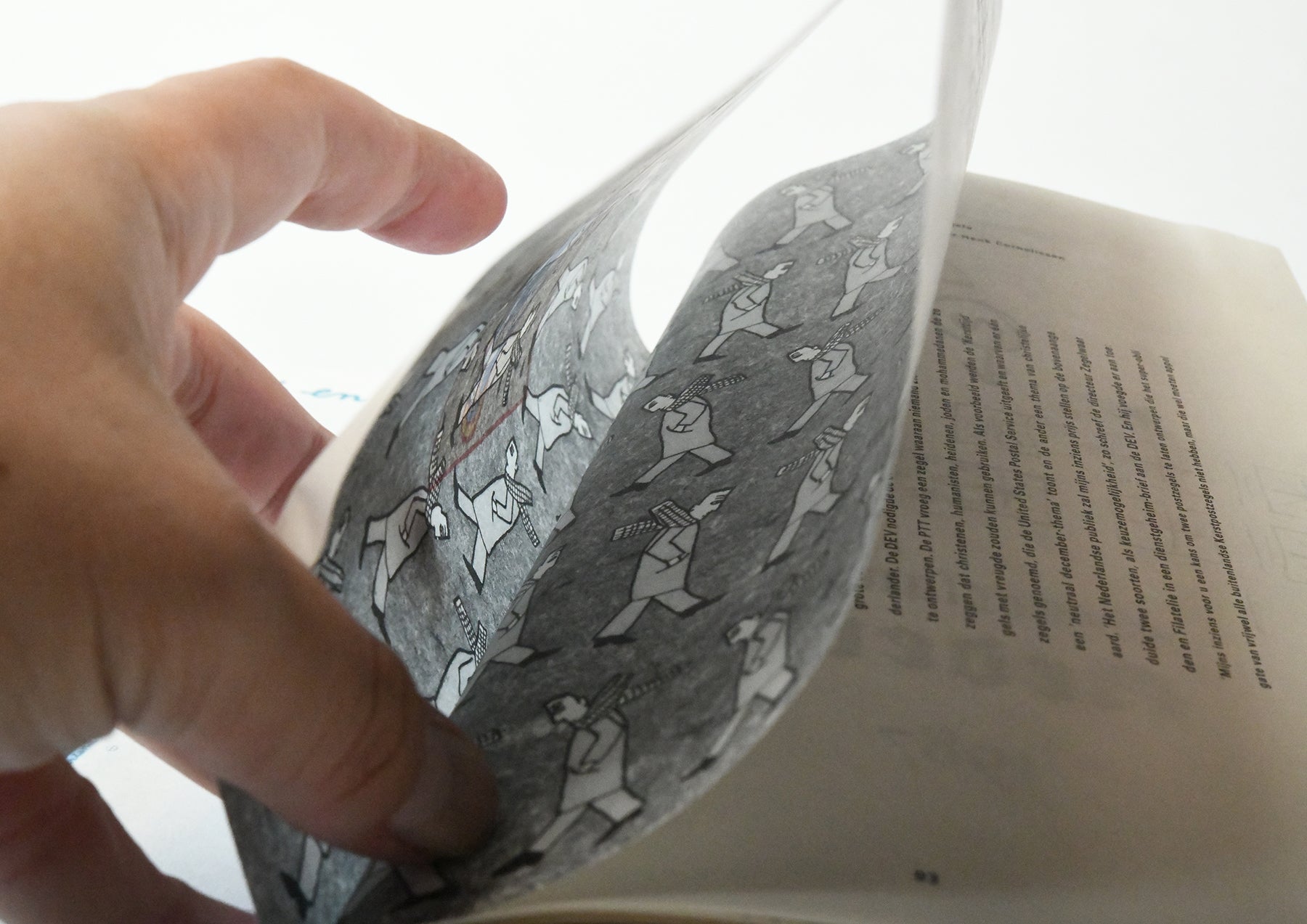
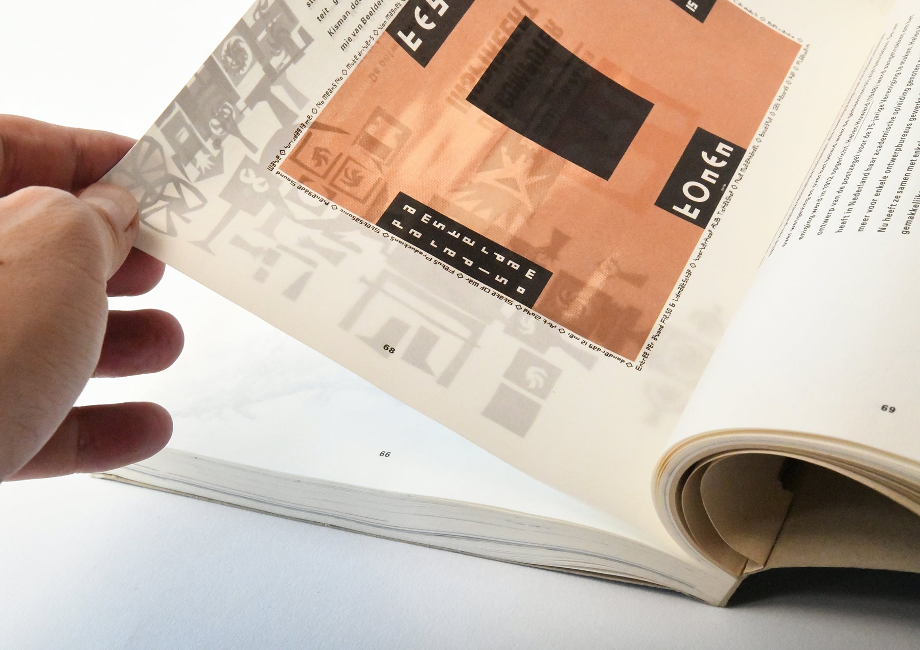
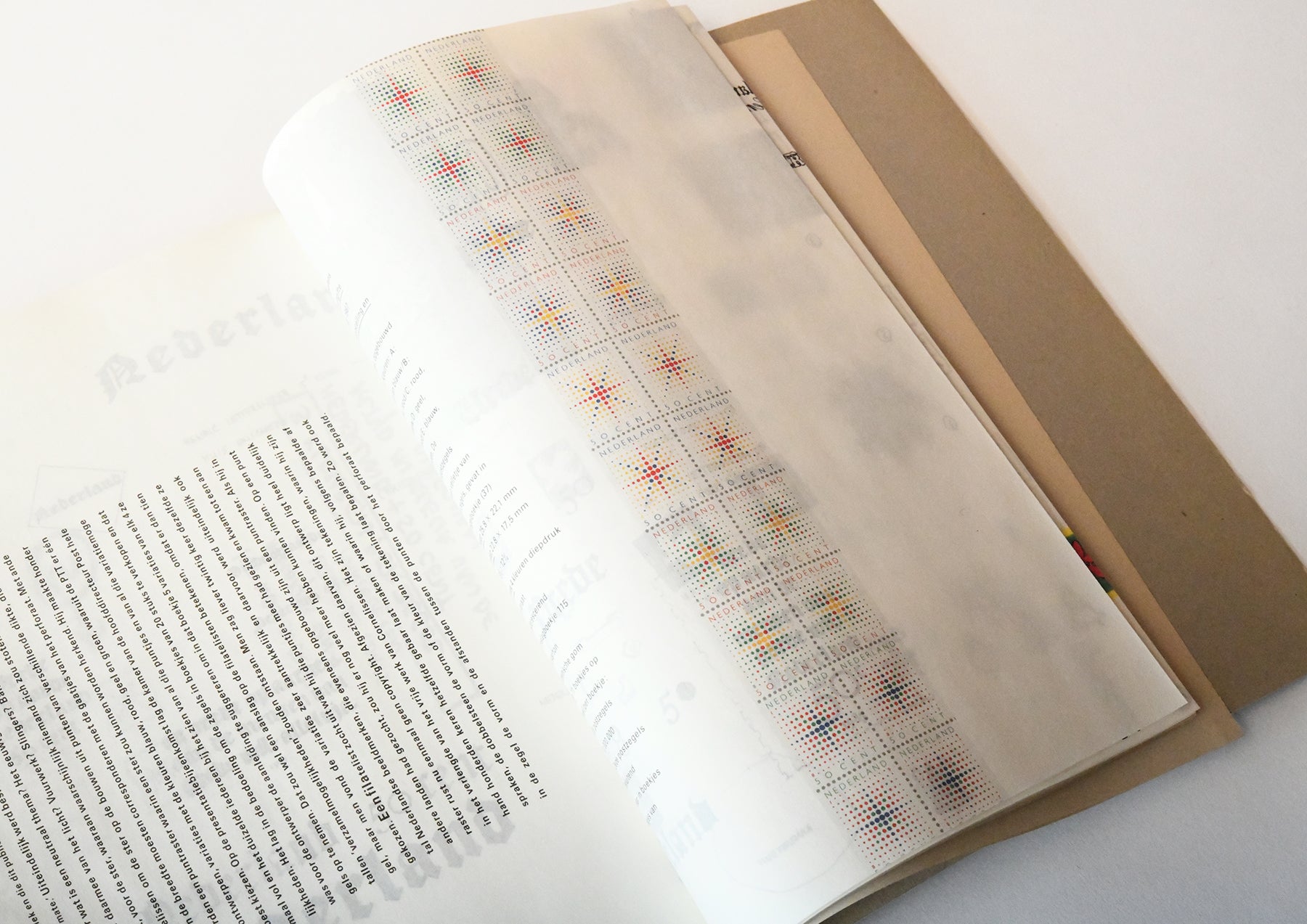
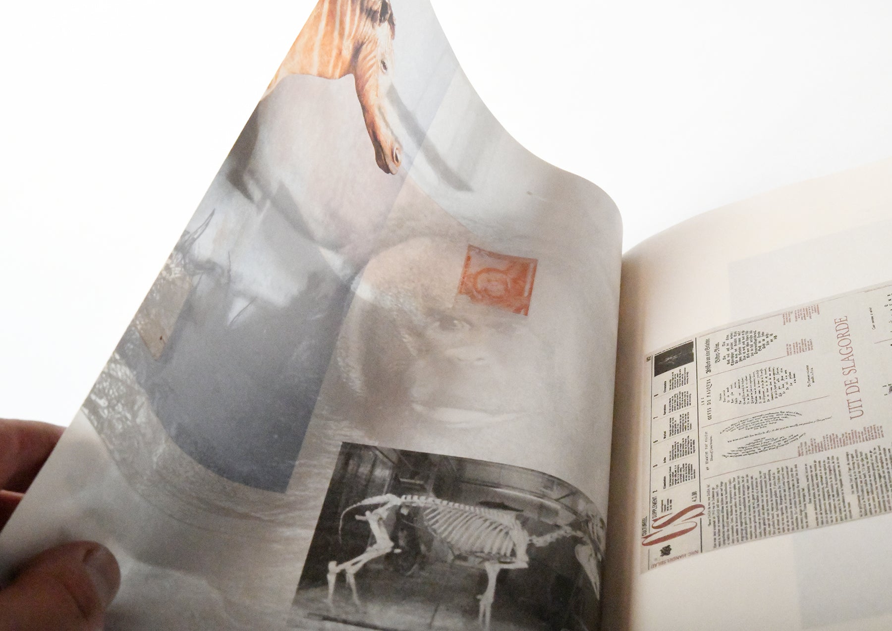
The mechanism that makes the stamp design appear multi-layered is clearly reflected in the printing and binding methods. The biggest feature is the sewn-in binding. It is different from uncut or sewn binding because it is not intended to be cut. When I first held it in my hands, I was truly surprised by this mechanism. When you hold it up to the light, the image printed on the inside appears like a watermark. Like a ghost of the image.
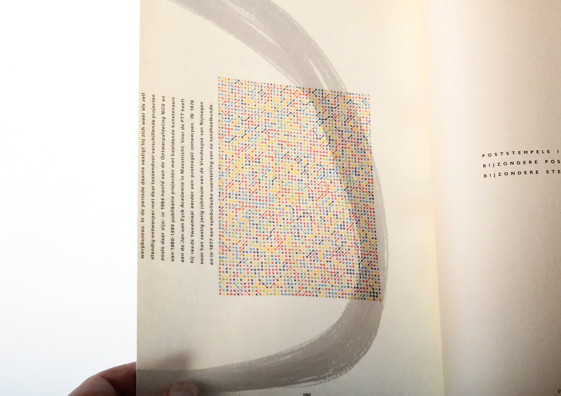
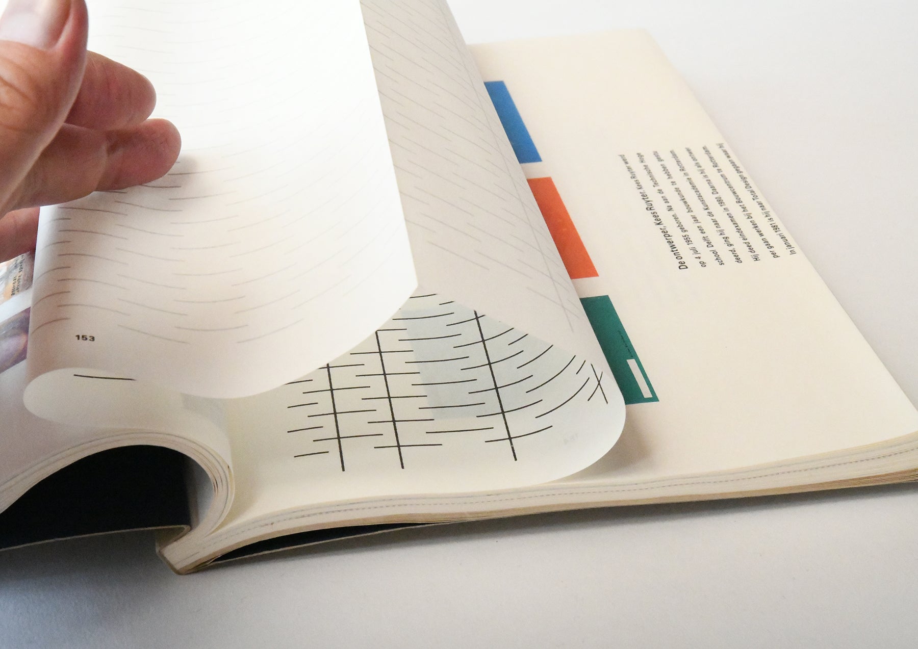
Irma printed a different image on the inside of the sewn-in booklet, which is never opened, than on the front. The pages visible on the front are printed in four colors using offset lithography, while the inside of the booklet is printed in one color black. When you look through the colored pages, it creates the effect of making ghosts of the past appear. This was before the collapse of the Showa bubble in Japan. This was before computer design, so Irma cut and pasted together the vast amount of image material he had collected, and used a Xerox printer.
The two yearbooks that were completed in this way were panned as "Brilliant Failures" and stamp collectors returned many copies and complaints. It may have been disappointing for those who were hoping for a catalogue with stamps arranged in an easy-to-read format. This was more like an exhibition on paper than a catalogue. However, it is interesting that Irma Bohm's first commercial publication was a failure.
Anyway, this was the first book design published by Irma Bohm when she was just 27 years old, before she became the most famous book designer in the world, and it was also her first award-winning book design. Even now, when Irma Bohm has produced many masterpieces and is praised as the "Queen of Books," this fragrant "failure" still shines brightly.
Finally, we will end with an excerpt from an interview that gives a good insight into Irma Bohm's approach to book design.
"If I compare my work to architecture, I don't build villas, I build social housing. Books are made industrially, so they have to be made very well. I'm in a sense for industrial production. That's why I don't like single books. With a single book, you can do anything. But to print in large numbers, you always have to be challenged. It's never art. Never, never, never."
“I compare my work to architecture. I don't build villas, I build social housing. The books are industrially made and they need to be made very well. I am all for industrial production. I hate one-offs. On one book you can do anything, but if you do a print run, that is a challenge. It's never art. Never, never, never.”
source:"PRINT" from July 31, 2018
Text by Osamu Kushida
