


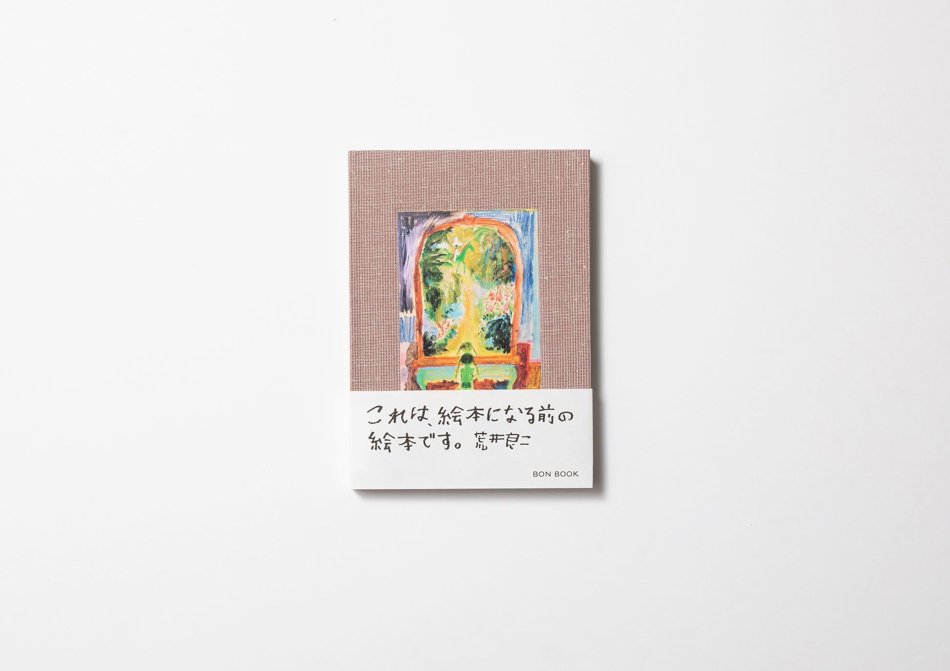
The Picture Book Before the Picture Book / Arai Ryoji


Bibliographic Details
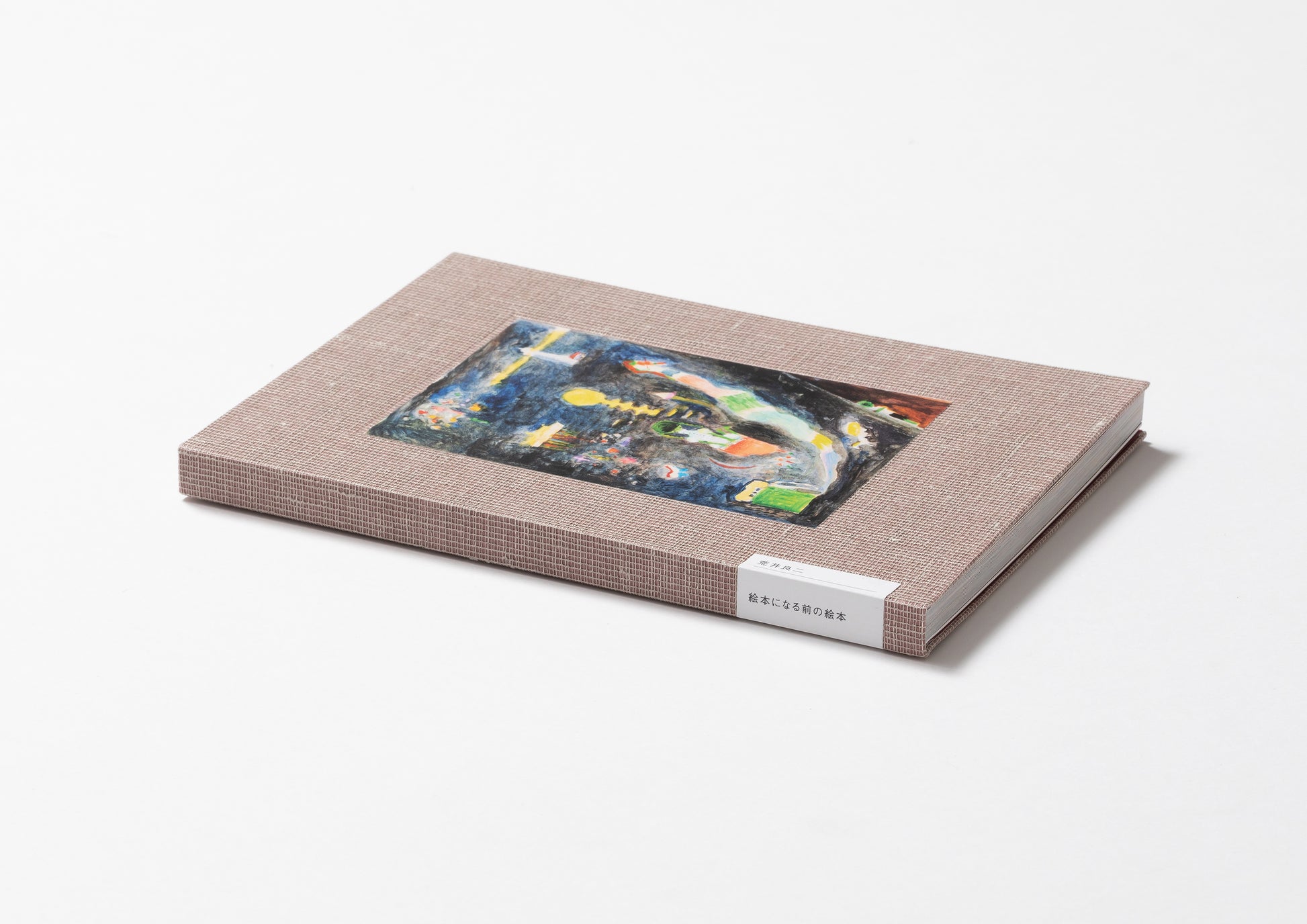
- Title
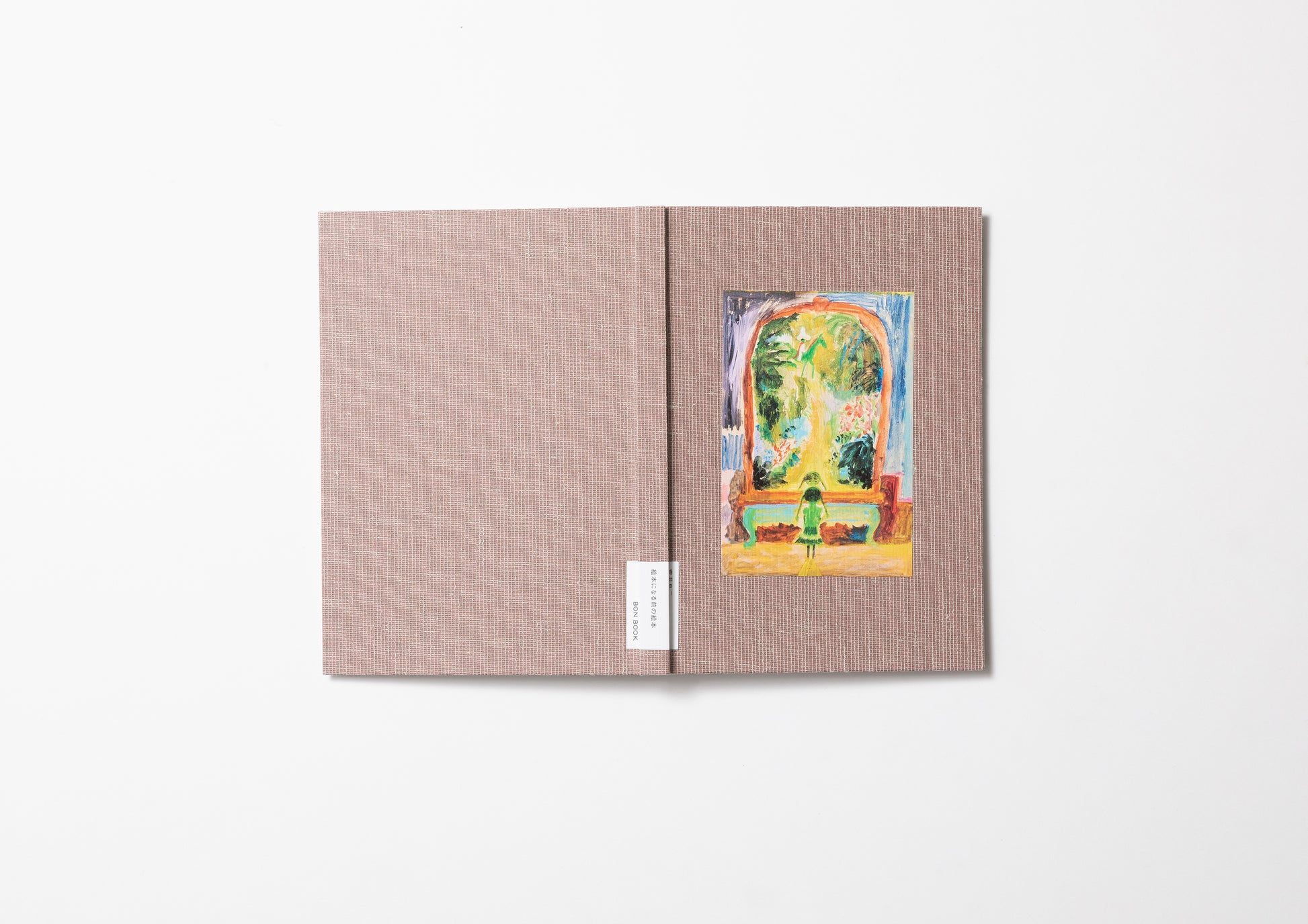
- The Picture Book Before the Picture Book / 絵本になる前の絵本
- Author
- Ryoji Arai / 荒井良二
- Director
- Osamu Kushida / 櫛田 理
- Publisher
- BONBOOK / 図書印刷株式会社
- Year
- 2022
- Size
- w148 × h210 × d14mm
- Weight
- 360g
- Pages
- 148 pages
- Language
- Japanese + English / 日英対訳
- Binding
- Hard cover / ハードカバー
- Materials
- Paper
- Edition
- First edition of 3000 copies / 初版限定3,000部 ※表紙は初版限定
- Condition
- New
Layout Design by Ryosuke Saiki 佐伯亮介、Cover Textile Design by Reiko Sudo 須藤玲子、Book Design by Yoshihisa Tanaka 田中義久、Special Thanks to Makiji Kojima 小島麻貴二 (margo), Orie Sakamoto 坂本織衣 (SEE MORE GLASS), Nao Katsumi 勝見奈穂、Sales Cooperation by 無印良品 MUJI BOOKS、Printing and Binding by TOSHO PRINTING CO., LTD. 図書印刷株式会社

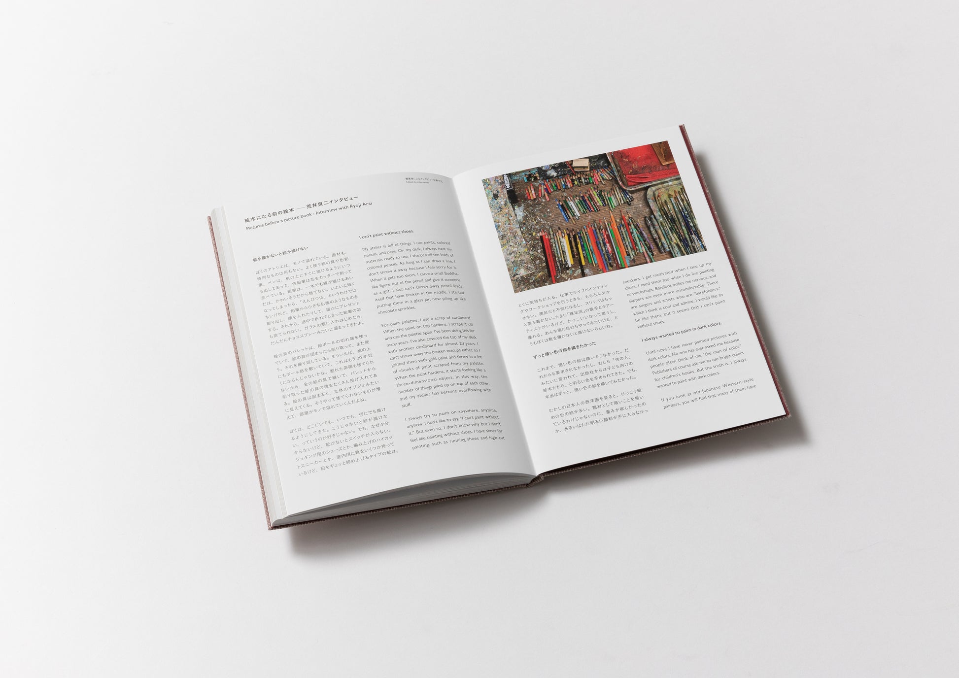
No one ever asked me to paint with dark colours. But all along, that was the kind of painting I wanted to make.
Ryoji Arai
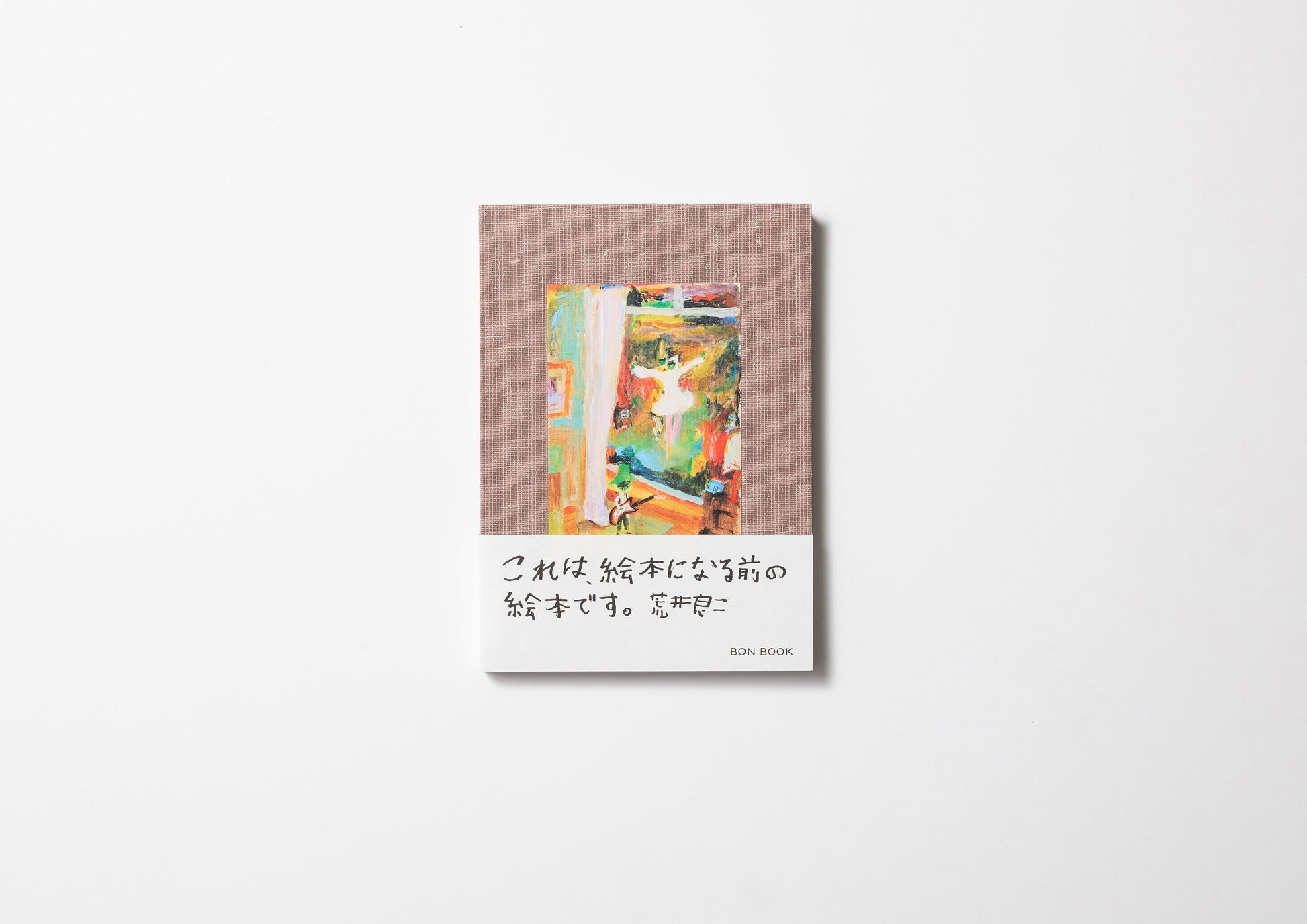
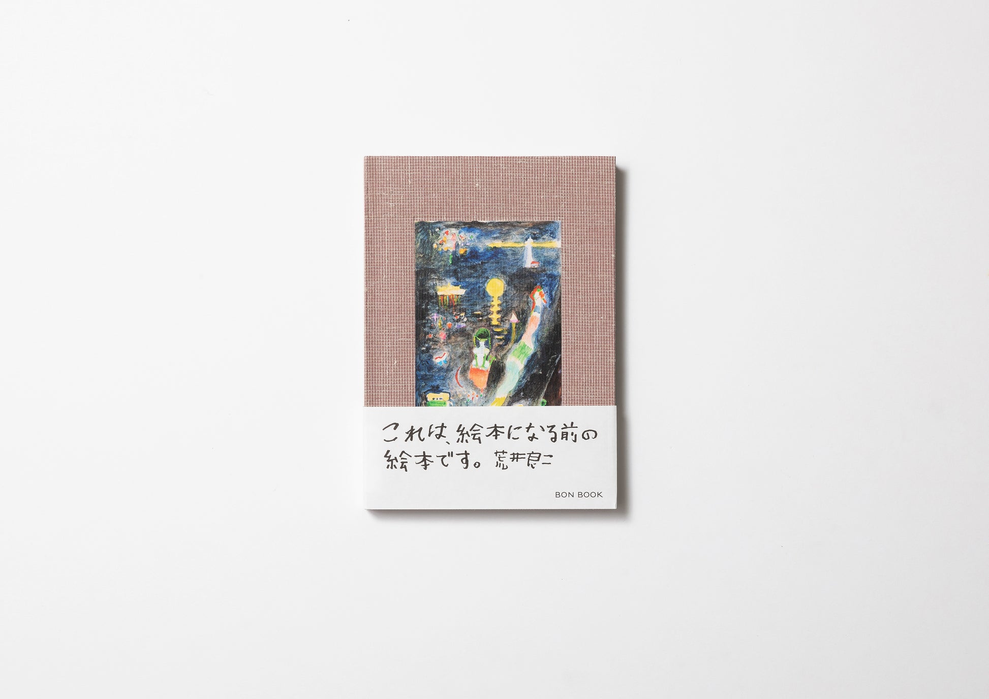
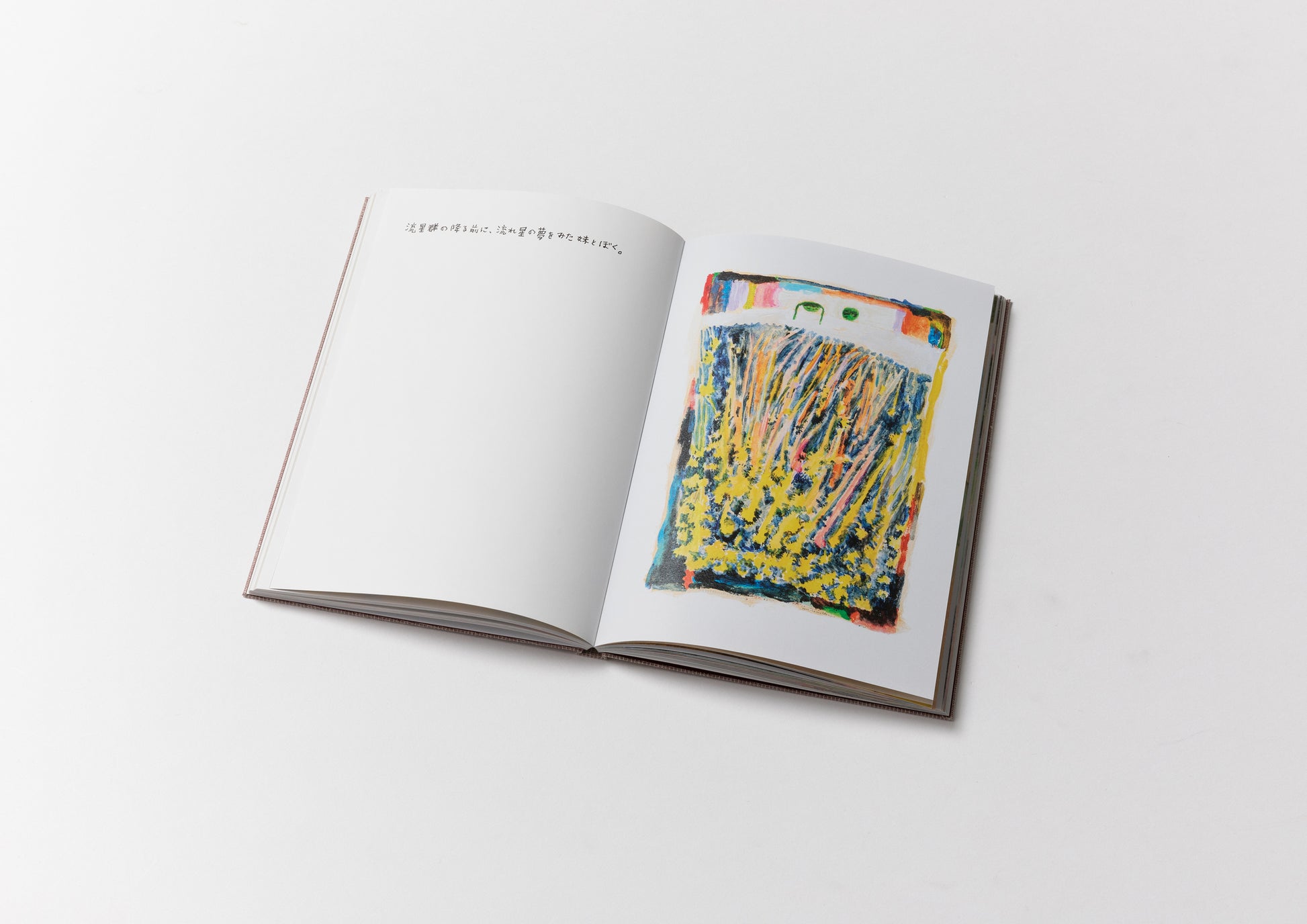
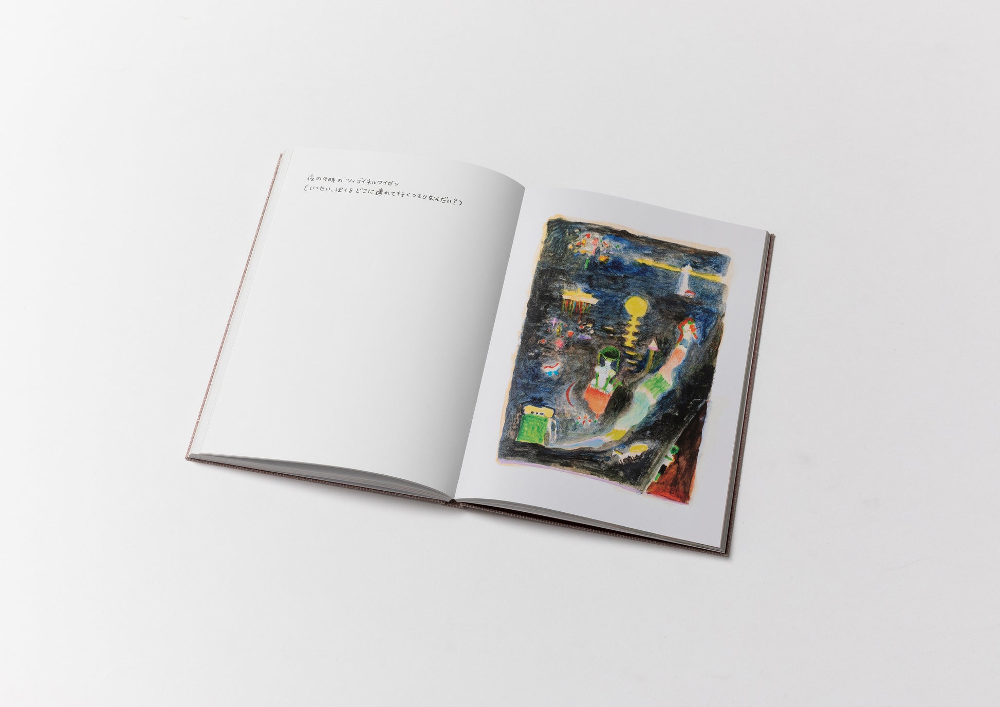
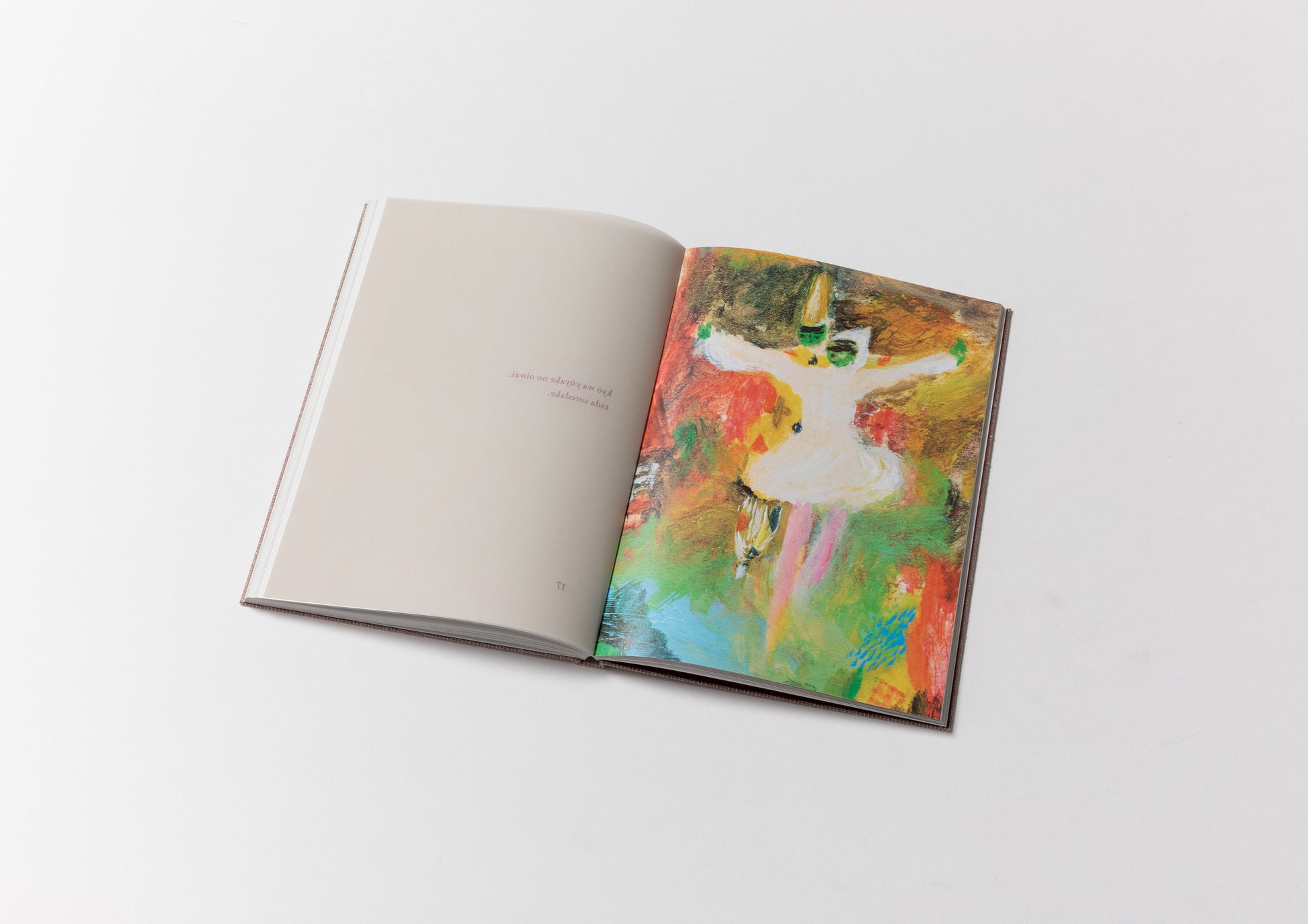
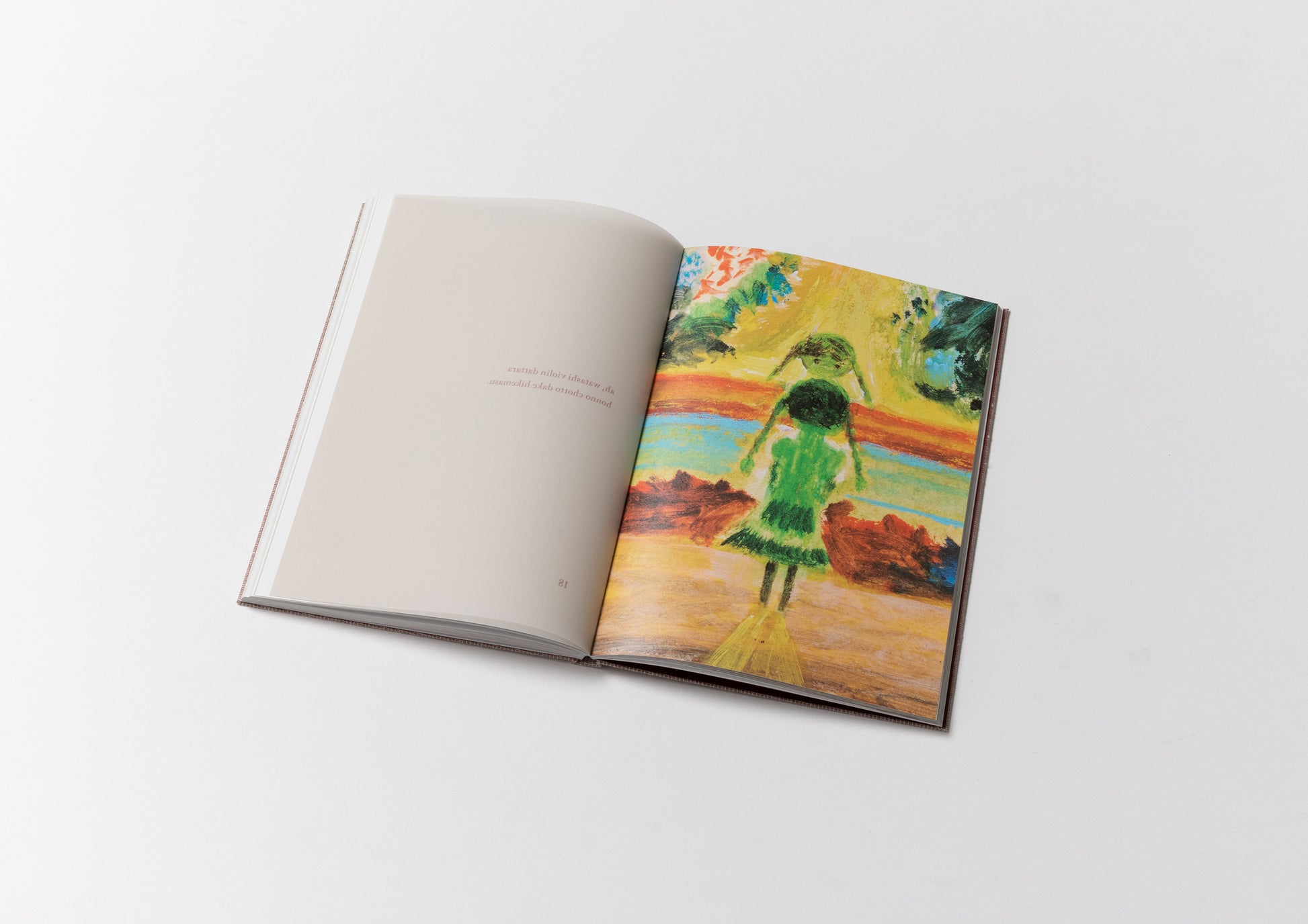
This book brings together twenty-three newly created original paintings by picture-book artist Ryoji Arai. Although they do not tell a single continuous story, every image seems to contain the beginning of a future picture book. They are filled with a nostalgic darkness and gentle light, as though Arai's own memories have become intertwined with those of someone he has never met.
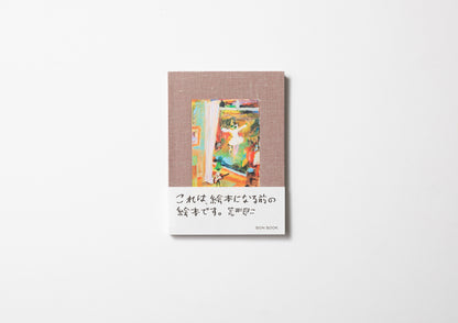
An exclusive interview with the artist appears at the end of the book. The first edition is available with three different covers (all containing the same contents):
- A: Ballerina
- B: Ghost
- C: Girl with Pigtails
Rather than creating another picture book, we set out to make what might be called "the picture book before the picture book." This volume is a collection of twenty-three original paintings created especially for this publication. There is no overarching narrative, yet each image feels capable of becoming a picture book of its own.
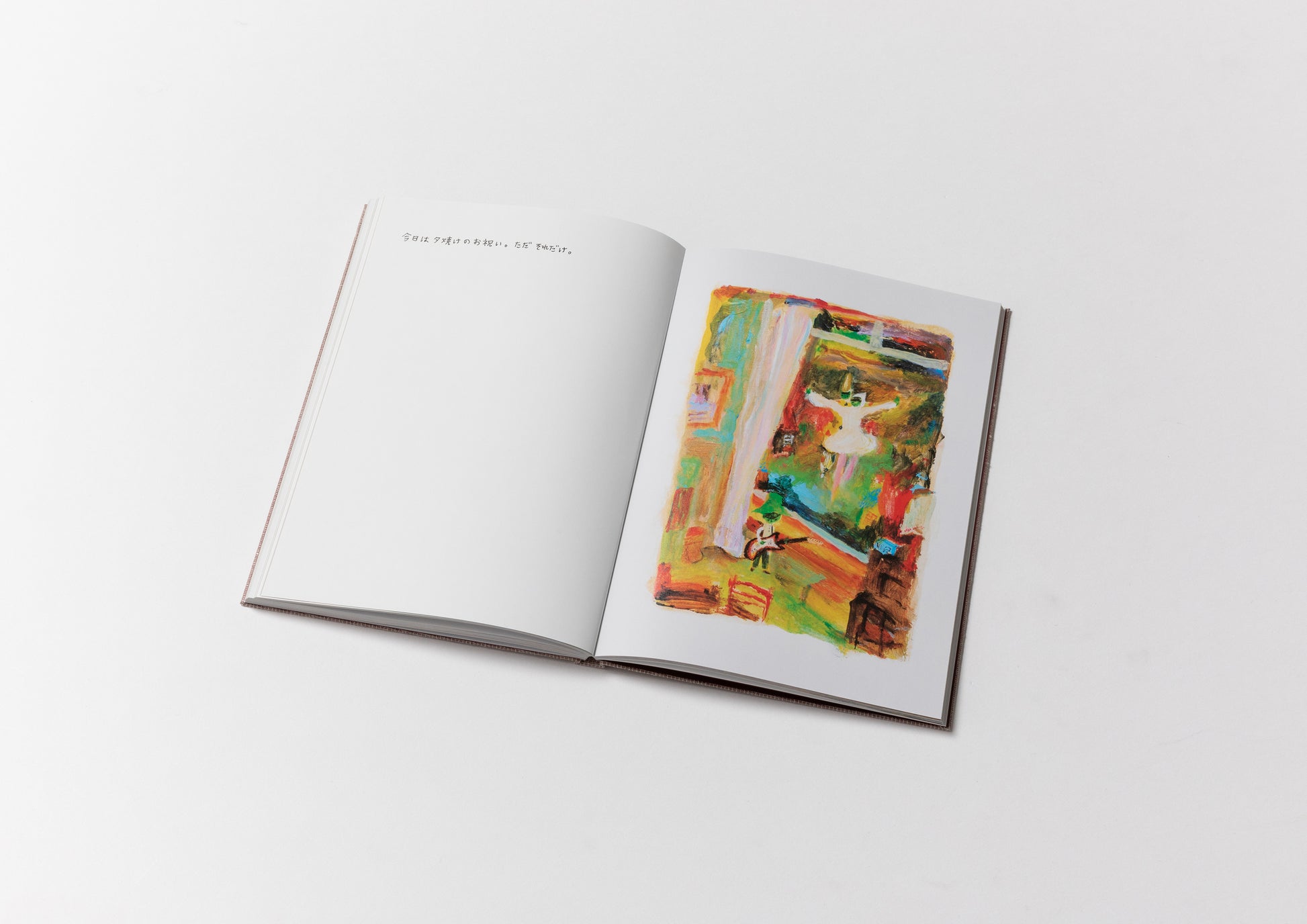
The paintings are united by a shared feeling of nostalgia for someone we have never met. Their titles read like fragments of songs distilled from diary entries.
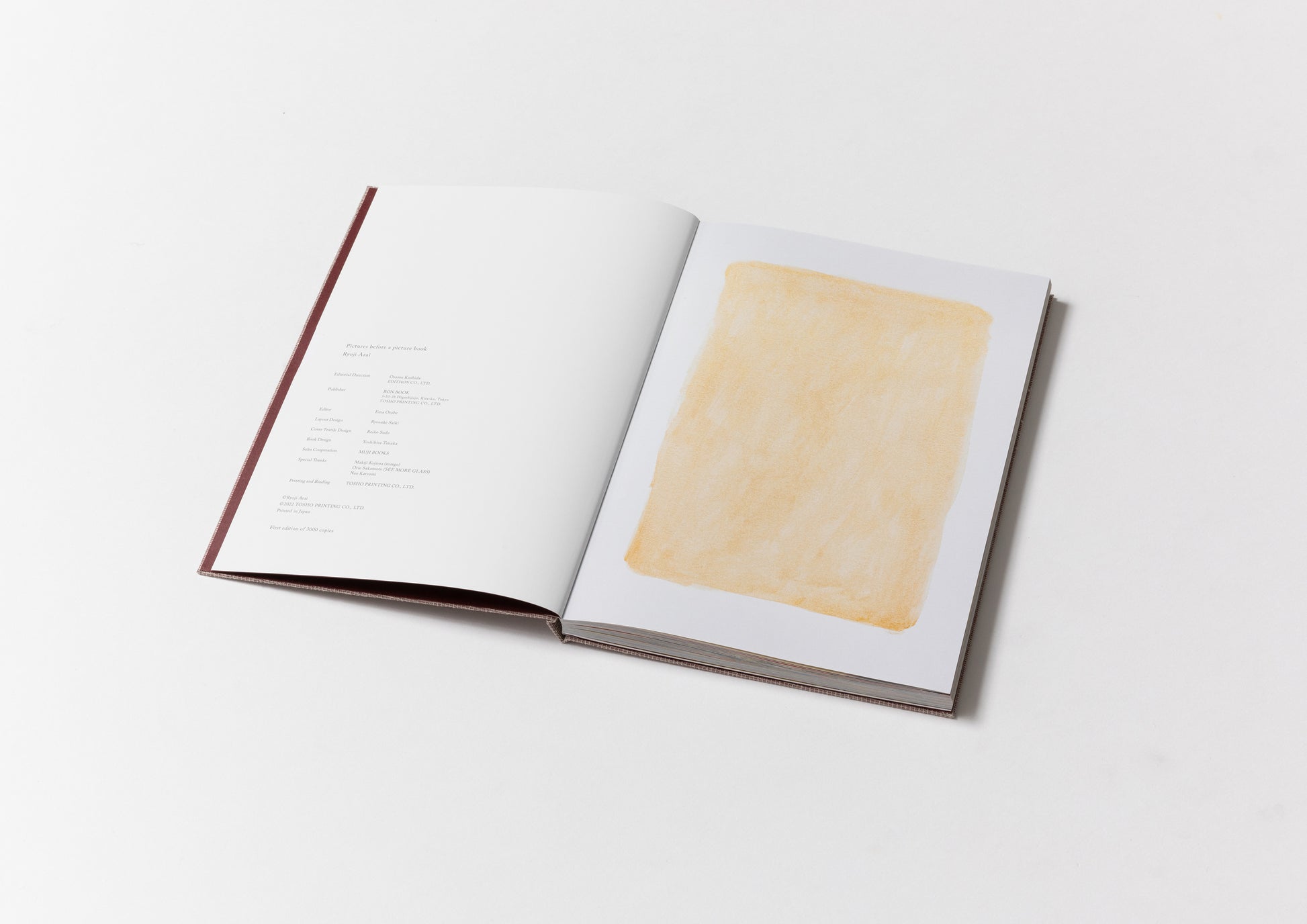
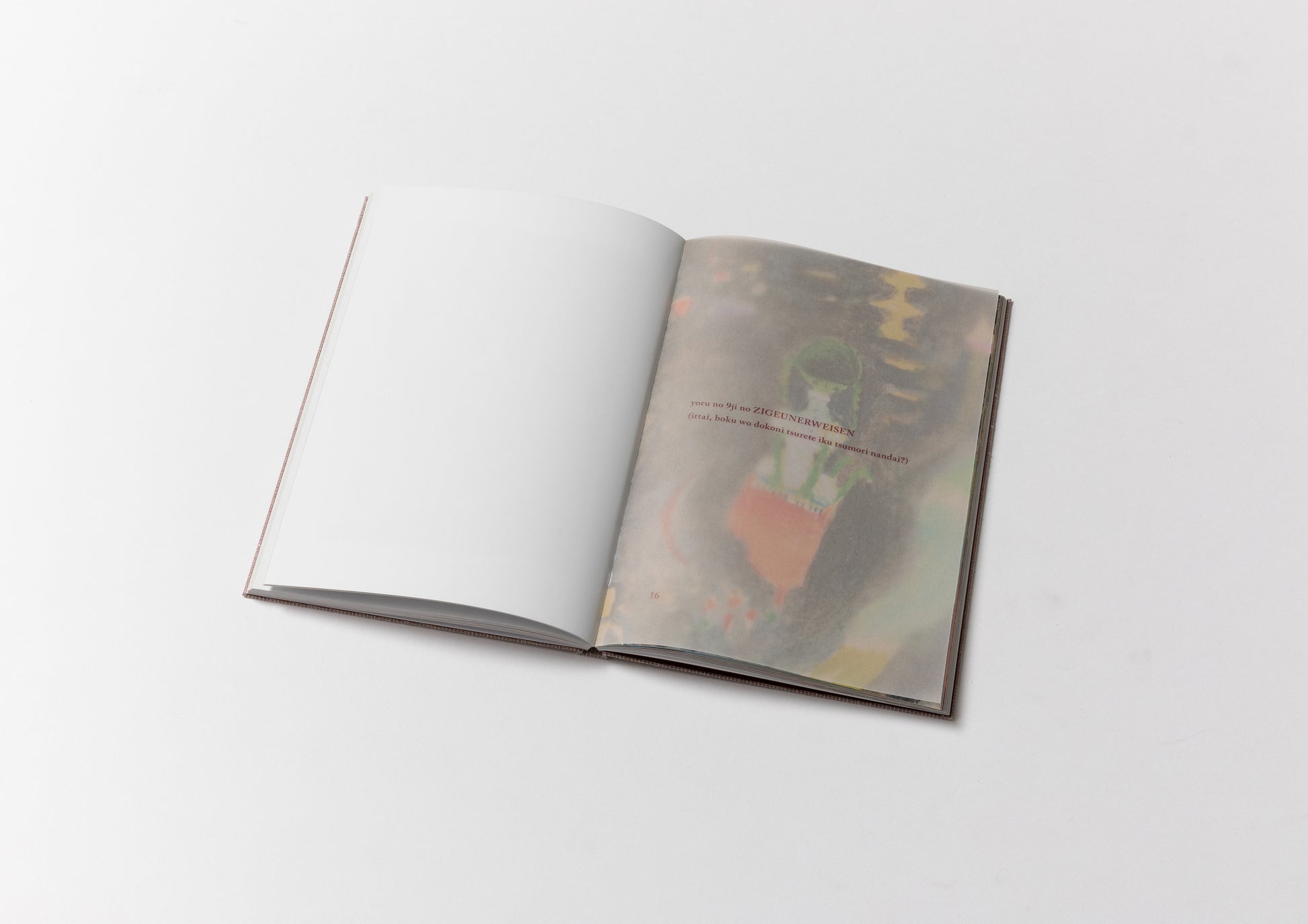
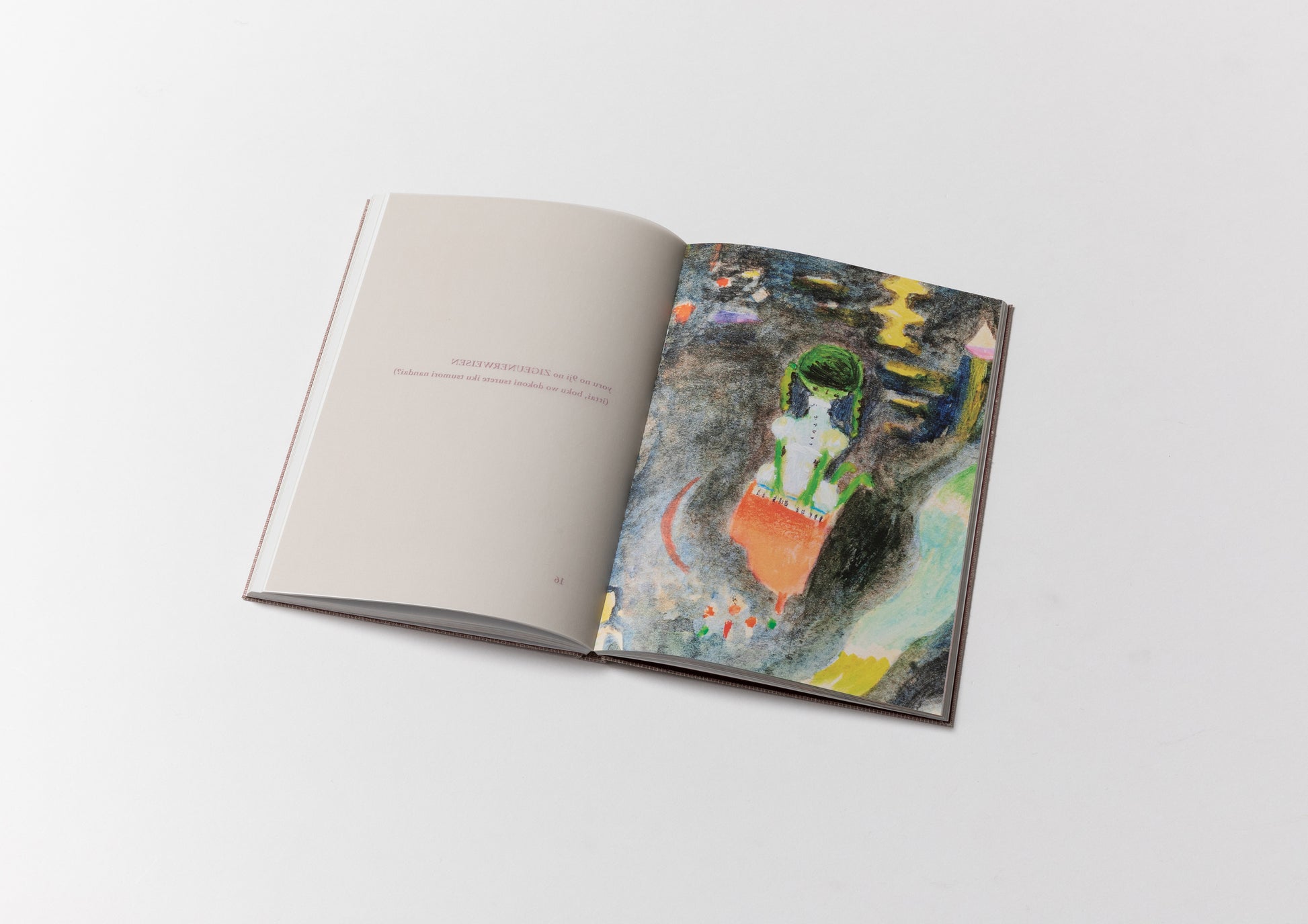
The first page is entirely gold. This is the ground colour Arai always applies before beginning a painting. Turning that page reveals the first work, followed by the others in sequence, and finally the interview at the end. The structure appears simple, but arriving at this rhythm required considerable experimentation. Above all, we wanted readers to experience not only the paintings themselves but also the gradual process of encountering an original work.
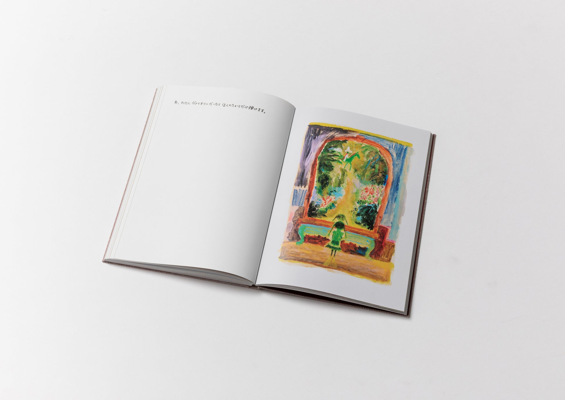
How could we reproduce the shimmering gold ground, the glossy surface of the paint, and its subtle relief? A printed book can never fully convey the presence of an original painting. After much deliberation—and without even telling Arai—we boldly cropped details from the paintings and placed these enlarged fragments before each complete image. By approaching the paintings this way, the brilliance of the gold, the texture of the paper, and the physical presence of the paint become even more vivid.
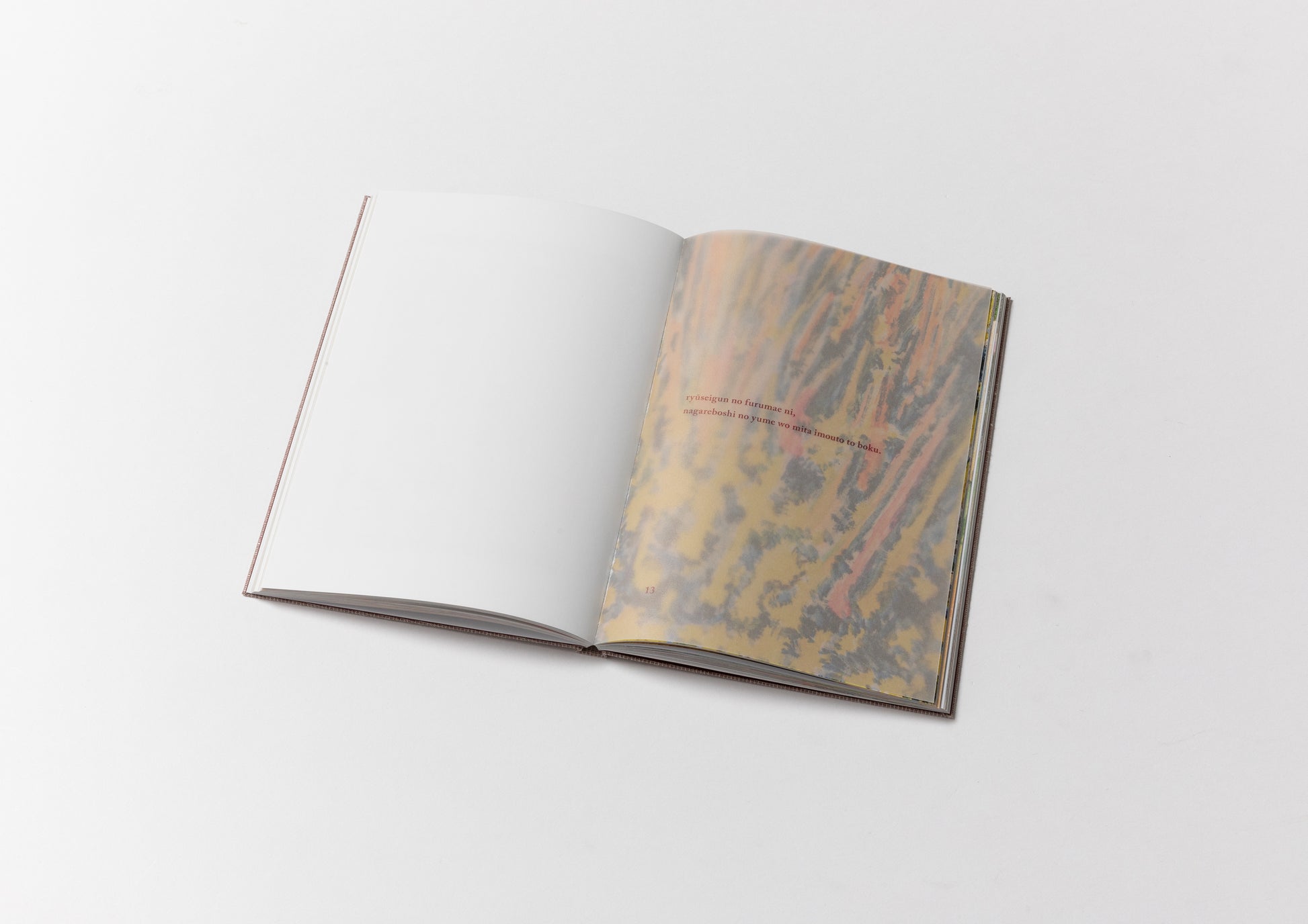
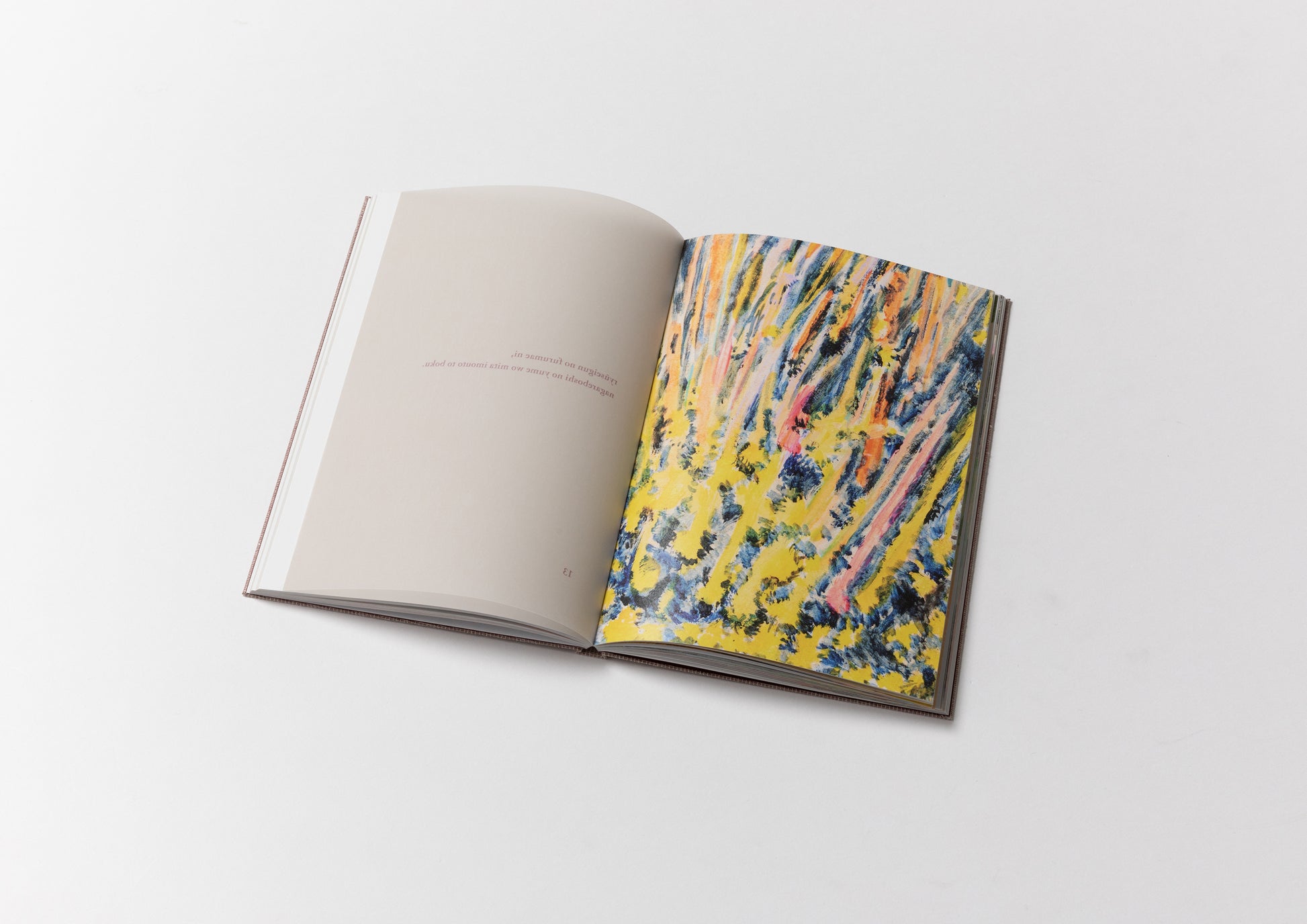
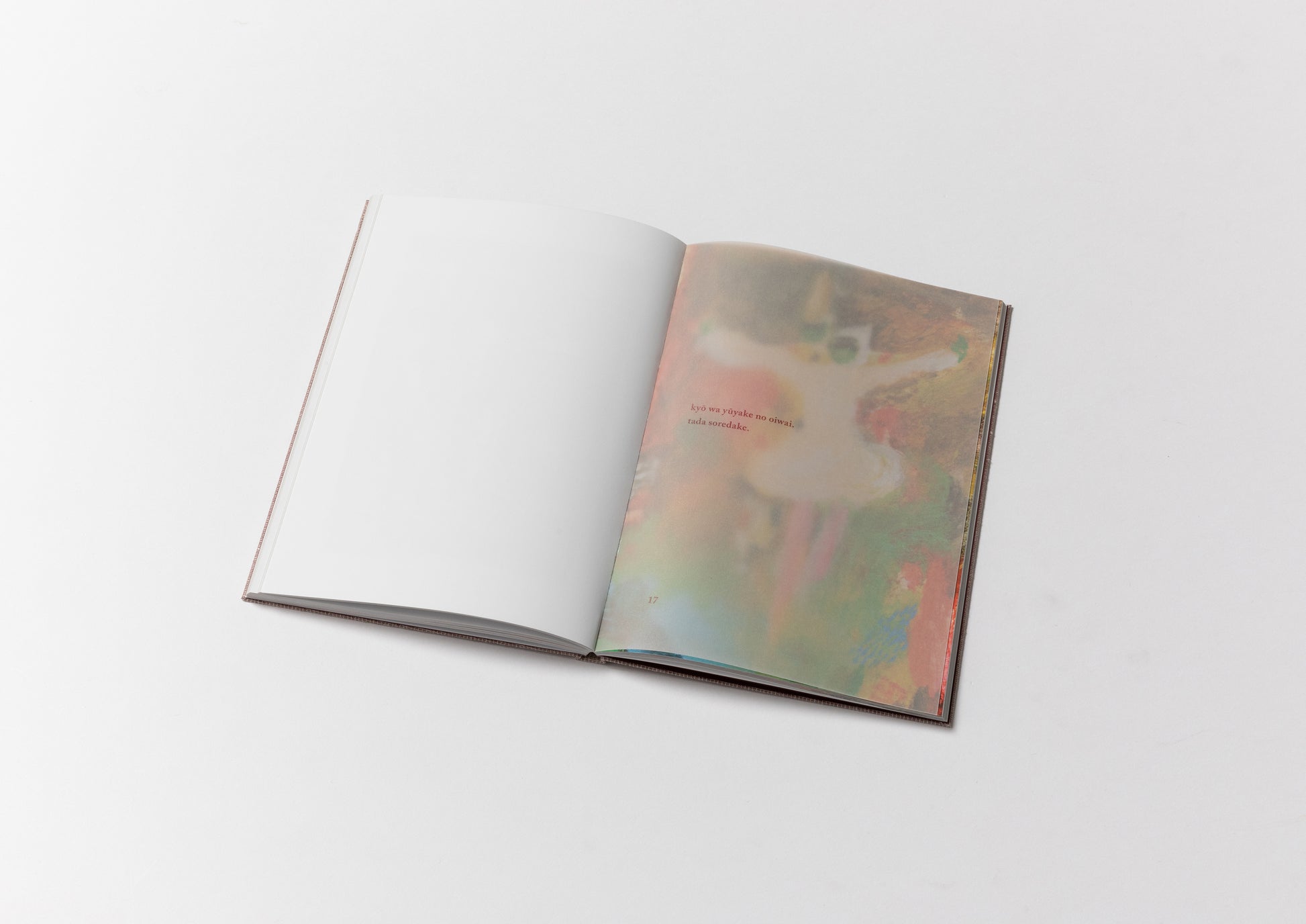
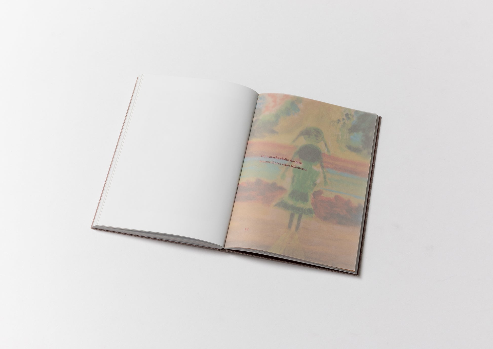
We inserted translucent sheets before these detail pages, printing only the titles in roman letters. Readers pass through these hazy, uncertain layers before finally arriving at each painting, creating the sensation of slowly finding one's way toward an elusive memory.
I think I was painting the landscape that appears beyond candlelight. If I stare long enough at the table or the window in front of me, another world gradually begins to appear beyond it. I hurried to paint it before it disappeared. Perhaps those landscapes don't belong only to me—they might belong to someone else as well.
Inspired by these words, we wanted readers to experience that indistinct world beyond the candle's glow. Semi-transparent sheets placed between the pages become a threshold to a world that remains just beyond clear sight.
There is another aspect that deserves special mention. The hidden theme of these new paintings is dark color.
Although Arai is celebrated for his vibrant palette and is often called "the artist of colour," he jokingly proposed that this project should be " Dark Ryoji." The idea emerged almost immediately during our first meeting.
As we discussed various possibilities—a retrospective, a new picture book, or a volume devoted to his daily drawing practice—the conversation turned to the illustrator Takeo Motai, whose work Arai deeply admires.
I've always loved Takeshi Motai. His paintings use dark colors, yet they never feel gloomy. Instead, they possess a quiet brightness and emotional weight. More than anything, you can feel how deeply he cared about every single painting.
I wanted to create a book made only of individual paintings—not a conventional picture book with a fixed beginning and end, nor simply a collection of existing works. I wanted each painting to be complete in itself, while still holding the possibility of becoming a picture book someday. I've always liked dark colors, but no one had ever asked me to paint that way. So I decided this time to become "Dark Ryoji." But in the end, the colors didn't become quite as dark as I imagined.

Profile

Photo by Masako Nagano
Ryoji Arai
Picture book author. Born in Yamagata Prefecture in 1956. After graduating from the Department of Fine Arts at Nihon University College of Art, he began writing picture books. He has won numerous picture book awards both in Japan and abroad, including the Special Prize at the Bologna Children's Book Fair in 1999 for "Nazonazo no Tabi" (Riddle Journey), and in 2005, he became the first Japanese person to win the Astrid Lindgren Memorial Literature Award. He is active in many areas, from curating at art museums to exhibitions, illustrating the opening of the NHK drama series "Jun to Ai" (Pure and Love), and serving as artistic director of the Yamagata Biennale Art Festival in the Middle of the Road. His main picture books include "Happy-san," "Sleeping Princess," "Today's Sky is Round," "Today's I Can Run Anywhere," and "Children Are Hooked." He is known as one of Japan's leading picture book authors, and his work has been attracting attention overseas as well.
